Packaging isn’t just eye candy. It shapes the consumer’s first impression of a product and can mean the difference between someone overlooking a product or converting on the spot. As traditional television advertising is on the decline and marketplaces have become more crowded, packaging has increased in importance, particularly among younger audiences who want to buy products that set themselves apart from the competition. Here are six brands with unique packaging designs that we love:
Tony Moly
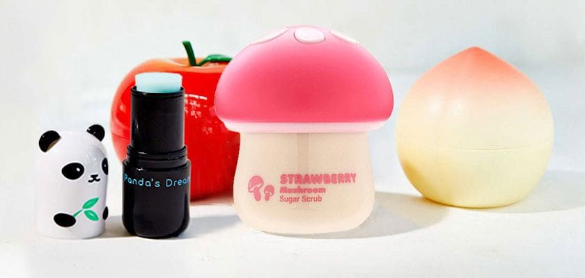
Tony Moly Cosmetics truly know their audience: young women who want to have fun with their skincare. Their packaging is fun, irreverent, cheeky and looks good enough to eat. From shiny fruit to tiny animals with cute faces, the entire line works together to create a whimsical, fun aesthetic that takes the chore out of skincare.
Why it works: Tony Moly cuts through the clutter to stand out from other makeup brands with so often default to neutral colours or pastels. For a different audience, it might not work, but Tony Moly products are formulated in the main for young women, an audience who often looks to stand out from the crowd and appreciates products that are a bit more whimsical than average.
Sofia Cans
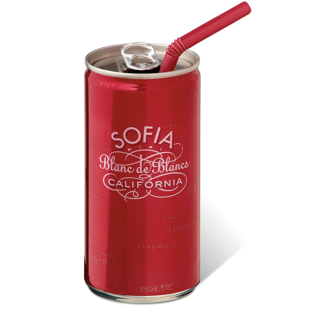
Picture it: It’s the middle of July, hot as blazes outside and you’re going on a picnic with your pals. They’re all beer drinkers so they’ve packed a cooler full of tall boys, but you can’t imagine sitting in the sun drinking something as heavy as a porter. You don’t need a whole bottle of fizz to yourself, but you want something refreshing to sip. Enter Sofia prosecco in cans! It’s affordable, adorable and tastes delicious. Add the cute little straw and you don’t even have to worry about messing up your lipstick!
Why it works: Boxed wine and canned wine are easy to mock. It often doesn’t taste great, it’s usually poor quality to begin with, and the stereotype is so strong you just know your pals are going to take the piss when you get out your can. Not with Sofia, though- besides the great taste, the posh packaging manages to look more sophisticated than a bottle in the same price point.
Hims
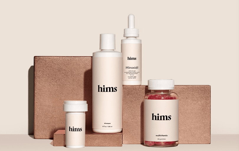
Men’s skincare so often seems like an afterthought from a branding perspective. It’s either sold in over-the-top packaging to seem as masculine as possible with scents like ‘Black Chill’ or ‘Jet’, or it seems like it’s just the same as bog standard products but with ‘FOR MEN’ tacked onto the title. In a landscape dotted with black and silver packaging, Hims stands out by going simple. The packaging is sleek, well-considered and looks different from everything else on the market.
Why it works: There’s an entire generation of men who don’t want to be part of masculine stereotypes. Hims manages to be masculine without being toxic, boring or placing their consumers into pigeonholes.
Coco Chocolatier
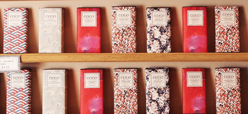
Edinburgh’s own Coco sells chocolate bars in vibrant packaging that can’t help but catch your eye. Each flavour is packaged in a different wrap, but together they make a bright, fun wall of products that make visitors to their shop want to tear into a bar.
Why it works: Sophisticated candy often ends up in packaging that is so elegant it can be almost off-putting to purchase (much less to eat!). Coco combines sophisticated flavours with trendy packaging: a perfect balance to appeal to any audience!
Persephone Books
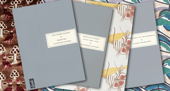
Persephone Books in London reprints obscure, out-of-print, lost or unknown books by women writers. The books are all bound the same way, in plain grey dustjackets with beautiful, customised endpapers and bookmarks unique to each title.
Why it works: We all know the old adage about judging a book by its cover, and Persephone Books takes that idea to its logical endpoint: if we’re not judging books by their cover, why do the covers matter at all? Their books stand out precisely because of their lack of decoration and allow the reader to feel good about having chosen a book based on content rather than aesthetics.
Dr. Bronner’s
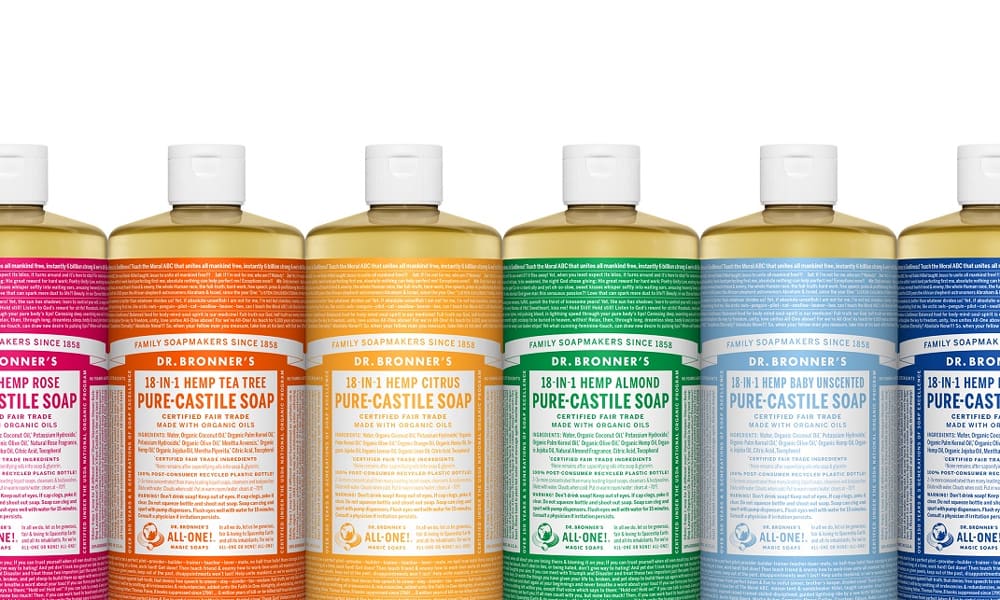
Dr. Bronner’s soaps go against every rule of traditional design advice: the labels are cluttered, the font is too small to read, the titles are long… but the branding works for them. Dr. Bronner himself was a Holocaust survivor who believed in the goodness of humanity and used his labels to promote these beliefs. His family continues to run the company today and have stated that the labels will not be changed except when changes in government regulations require it.
Why it works: The bright, cheerful colours of the labels on Dr. Bronner’s liquid and bar soaps echo the message of friendship found in the (admittedly incredibly small) text on the labels. The most prominent text on the labels are the ingredients, which are natural and sound healthy, and the amount of text on the label almost begs consumers to pick it up and engage with it. If a consumer goes has enough interest to skim the label, the messaging is positive and uplifting, even when the eye skims over it. They look great on a shelf together and it’s hard not to be cheered up just from looking at them!
As consumers look more and more beyond traditional brands, packaging remains the quickest way to attract attention in shops. If you want loyal customers, you need packaging that reflects your branding and your company’s personality.
Looking for branding ideas for retail products, interiors, ads and more? We can help!
