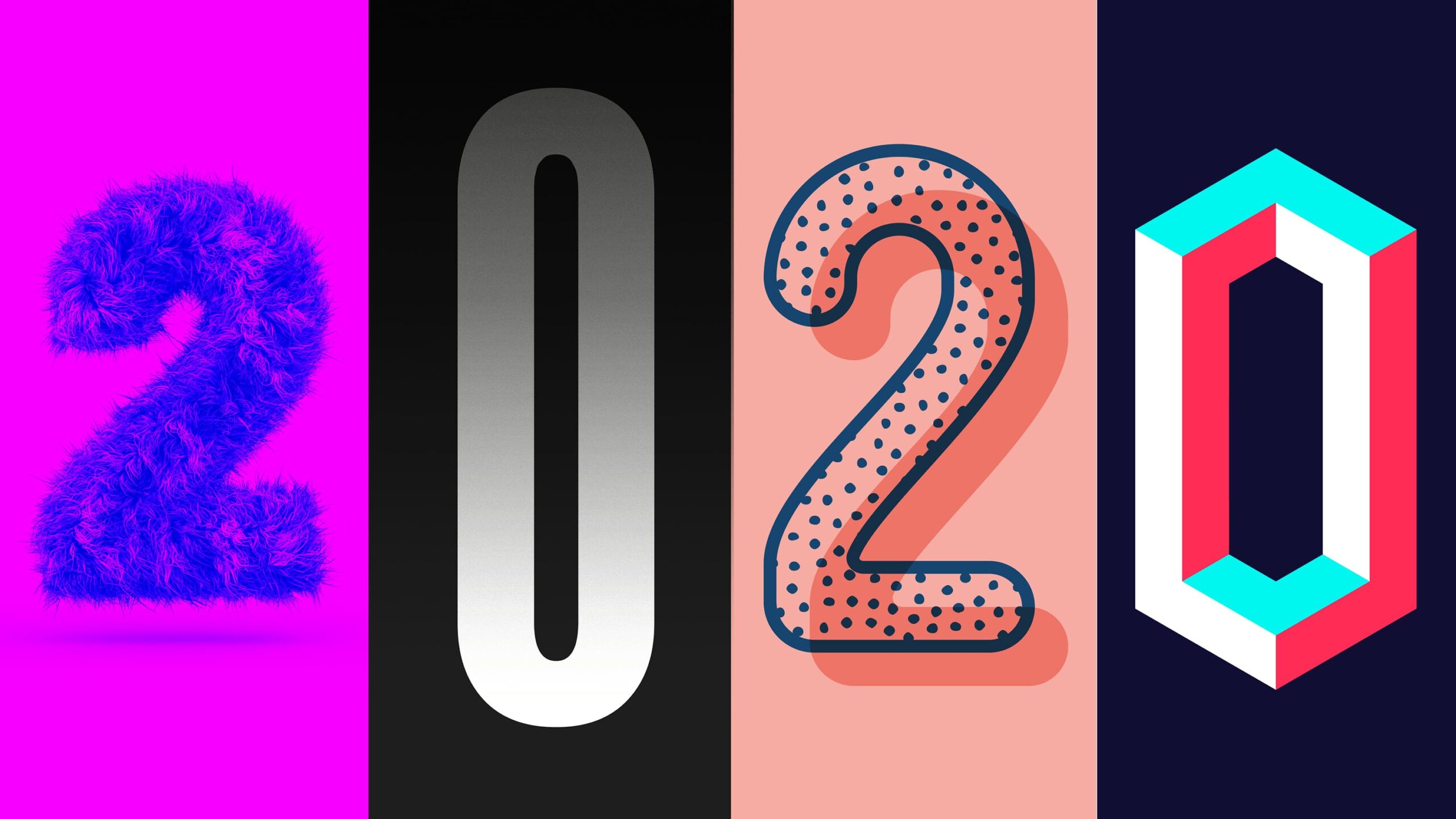
Popular design trends are perpetually evolving. Year after year we can look back and pinpoint the most popular trends. These trends could be the next ‘Swiss International Style‘, they could stick around and evolve, or they might not even last a week.
Last year’s blog, ‘6 Top Graphic Design Trends of 2019′, references the trends; minimal meets bold, isometric images, motion graphics logos, variable fonts, asymmetric design, and gradients. Whilst 2019’s top trends do remain popular (you only have to look onto your Instagram feed to see this) some of these trends are becoming stagnant and overused.
The significance of trends, however, can be a source of much debate amongst designers.
It can be argued that trends are a valuable means to stay in touch with the current creative culture and attract consumers with what is ‘in’. Conversely, it can be believed that the following of design trends allows the desire of aesthetics to take precedent over the function of design.
So, which is it?
As a relatively recent graduate – I can endorse design trends for their value to learning, following trends allow designers to learn from one another and become inspired.
Learning as well as creating require some sort of inspiration – rarely is a design derived from thin air, therefore trends seem necessary to follow.
Trends fluctuate continuously, therefore it is important to be able to recognise and implement these trends within your designs. Arguably, a good designer does not ignore trends. Instead, they have an understanding of trends and utilise them to improve their work.
Additionally, trends are important to attracting consumers – your design is currently popular therefore it is what consumers are interested in and will buy in to.
So why are some designers against such an arguably vital tool?
It can be argued that following trends is a means to create something ‘cool’ without actually considering the process and reasoning of your design. This suggests that trends are preventing designers from thinking past the realms of aesthetics.
In creating what is currently popular could purely be a means to ‘fit in’ – designs become generic as to not provoke clients and consumers, but why in the world would you not want your brand to stand out? This means work becomes one of the majority, blending into a sea of same-y designs.
Furthermore, trends can be seen as a quick fix – ‘copying work’ as opposed to creating new and original concepts. This conveys the idea that trends allow for ideas to be stolen and no lateral thinking to take place.
In my opinion trends are valuable assets to any designer for becoming inspired and keeping up to date with style. However, you should never get caught up in trends. Instead, you should be smart, be inspired, take what you need from a current trend to develop an interesting and unique solution that works for your brand.
Whilst style-based trends have developed and changed over the decades, what is perhaps a more important trend to look into is purpose.
After visiting The Design Museums exhibition ‘Beazley Designs of the Year’ in November, it was evident how much drive in the past year there had been to create designs that focus on highlighting social issues or offer a solution to current issues. For example, creating an interactive design, considering the user experience at a deeper level, and tackling issues of gender and feminism are becoming increasingly popular.
Whether trends are brand new, have exponentially grown in years past, or are making a come-back, trends will still appear year after a year.
Here is a look into what is becoming popular so far this year.
I have noticed ‘3D and Realism’ appear more and more in design, this trend has been around a while and I don’t think it is going anywhere anytime soon. This trend is becoming increasingly popular as technology has developed – and continues to do so. It has become easier to create a design that is tangible but also can design what doesn’t exist – providing endless possibilities. I can see this trend continuously growing over 2020, one trend that could conflict, however, is ‘Simplification’. We have seen this trend increase in popularity recently – whether it is 2D or 3D – it seems fashionable to reduce visuals down to their basic elements as a means of representation. This may be nostalgia or to create a differing visual aesthetic. Either way, it seems to be proving popular.
Minimalists – most designers are or they aren’t. ‘Going Monochrome’ is certainly one for the minimalists. A resurgence of the ‘duotone’ craze of 2017 sees a more sophisticated approach to the use of a single colour. The likelihood is this process of the colourised images and brands boasting one colour design will cease over the next few years, but monochrome is never going to go out of fashion.
Now, for those not so minimal there is the rising popularity of the very trendy ‘Zero Negative Space’ , I find this style – if done incorrectly – the ‘comic sans’ of design. But, it is worth a mention as design moves from an expanse of white space, to overfilled, almost chaotic approaches to layout, it is interesting to look at, at least – maybe that is why it has become so popular?
Whilst ‘Isometric Illustrations’ allow for a better demonstration of three dimensions, the technique feels overdone already and with the preference for three-dimensional realism – I believe this will be the favoured solution.
The three-dimensional design does appear to take priority, however, there are other popular approaches to get excited about. ‘Patterns and Textures’ being one. Whilst the once-popular flat and simple design has taken a back seat, patterns are appearing more and more. Much like patterns ‘Liquid Illustrations’ are allowing designs to come to life. Yes, ‘Geometry’ will always be key to design, but this abstract creation of movement and interest in design is something I hope to see stick around.
Last but not least, typography. Typography has a catalogue of trends within itself, so I will keep it brief. In 2020 we will likely see a lot more ‘Playful and Artistic’ fonts, hand-crafted type certainly creates a lot of character within the design. You can also look out for ‘Stretched Type’. Playing with fonts has become a lot more popular recently, a means to express meaning within a font and with variable fonts still popular it is certainly something you will see. Whilst the fonts are being manipulated so are the layouts themselves with ‘Repetition’, ‘Repetition’, ‘Repetition’ used to emphasise a font. And, finally, ‘Letter space’ – words spaced out and spread across the page, broken up and rearranged.
So, there it is the proposed design trends of 2020, with my thoughts and predictions of what might happen in the year ahead, whether these are the trends of 2020 we shall have to wait and see, that if you see them as the valuable asset they truly are.


