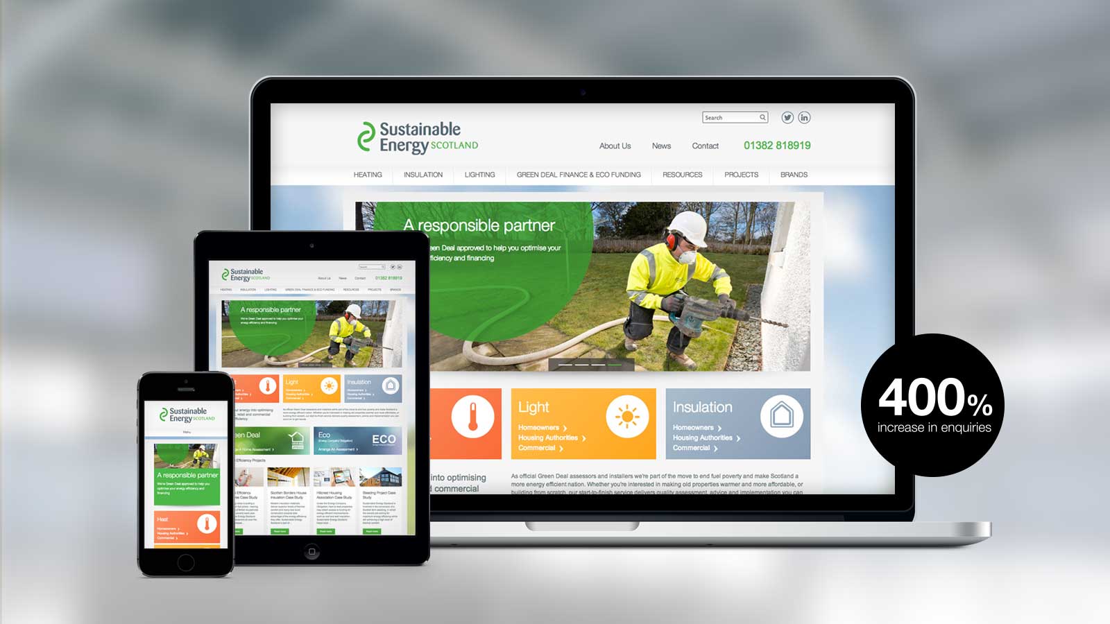
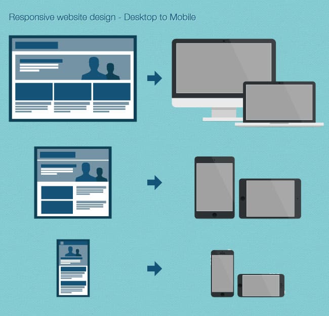
More and more people are using alternative devices/platforms to view web content every day. It is becoming increasingly important to ensure that they see the website tailored to the device they are using to deliver the optimum experience of the website.
There are two methods for creating a responsive website design. These are:
Adaptive – Multiple fixed width layouts
Responsive – Multiple fluid grid layouts
The method chosen can differ from project to project with client requirements, grid framework and target audience all being determining factors.
There are many reasons to adopt a responsive design with a web project. Here are some of the pros:
• Develop once and it covers all bases
• Updates to the site are rapid as any changes to content will only need to be applied once for all platforms
Cons:
• It takes a little longer to build the site in the initial development process (although this time is still significantly less than building an entirely separate, mobile specific website)
There have been several responsive layout frameworks developed to assist developers when beginning a new web project. These frameworks provide a set of guidelines to follow, and sample code in place to ensure that the design can be easily transferred seamlessly to a fully functioning responsive website. Here are a few of our favourites:
• Twitter Bootstrap
• Zurb Foundation
• Skeleton
• Grid960
Recently there has been some debate as to whether or not the best method for designing a website is still to start with the desktop and scale down for mobile devices. Many people are now suggesting that we shift the thought process to considering mobile devices first, and then add more content and functionality as the device screen size increases.
My thoughts are that this debate will continue for some time to come yet. Each project is different, client expectation will differ and target audiences will vary, so, therefore, each approach deserves unique consideration. In some instances, I will design for the mobile and scale up, and in others, I will design for the desktop and scale down. One thing I am certain of though is that responsive web design is now an essential part of every web project and not catering for all devices will only alienate a large proportion of visitors to your website.
Elastic provides web design services. Please contact us to find out more.
