Packed into a table seat, my elbow trying its best to bend the glass in the window, I slipped my laptop clumsily out from my backpack that was wedged firmly between my legs. With over 6 hours to go I was determined to spend it watching a little known series called Game of Thrones. At the time, I honestly knew nothing about the show apart from a few passing comments on the web. Being the hard working student I was, I scoffed at the gentleman sitting next to me trying his best to push the boundaries on colour selection in his type-tastic Powerpoint presentation and pressed play. The ‘psssht..Huuuhhh’ of the HBO logo preceded the best ‘Sit down and shut up’ title sequence I’d seen in a long time. Now, of course, we see the GoT title sequence in the same way as that coffee machine we bought with such excitement but now we’d rather have it out the way so we can get to the more important stuff. Like making coffee.
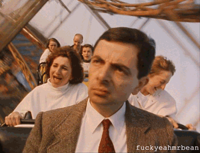
At the time the sequence blew my tiny Welsh mind. Crammed on a train full of podgy business people, tired families and boastful travellers, I was being transported into another world within seconds. This is where titles come into their own. It told me where was what and what was where. It also told the pestered man next to me that I wasn’t in fact watching porn, it was a show. No really sir, there’s no need to call the police, these people are Lannisters! The bravery of the sequence when it was given the task of setting up such complex and compelling storytelling was inspiring. For years I’d watched opening titles the same way Mr. Bean rides his roller coasters, appreciating what it was doing but never getting excited about the experience. Now, I go out of my way to track down sequences like wild Pokemon. I’ve watched from afar the tantalising set up of Momoco, Peter Anderson Studio and (as we’ll see in a moment) Imaginary Forces. These teams in particular produce such compelling sequences and motion work that it’s a joy to go and see the films, shows and work they create. More exciting still is the processes used to put together such pieces.
As with everything creative, it’s the careful mixture of madness and focus that produces the stellar work. There’s many examples of titles being created which completely destroy anything that came before it; Dr. Who, for instance. The way that sequence was put together should get you up out of your seat in excitement shouting “Forget about the lunchtime meal deal, today we dine on AWESOME!”. How was it achieved? British designer Bernard Lodge mixed video feedback (filming his camera’s own monitor, producing a crazy loop of visuals) commonly known as ‘howlaround’. The process produced a title sequence that has traversed the last 50 years like it’s a regenerating time traveller in it’s own right. Looking at each variation of the titles throughout the years you can almost taste each decade’s trends seeping through into each design.
In 1970 the original Doctor Who title sequence was recreated using colour, which further cemented it’s alien natured design. As it should be, colour has been a huge feature on many a title sequence. One of the best examples is from a film that completely passed me by when it first came out, but which has a beautifully simple title, Drive. Vibrant pink type strike a visual harmony with the Bailey’s smooth shots of the city accompanied by Ryan Gosling driving about like moody boy racer who has a harsh mortgage to pay. Add the fantastically produced music track Nightcall by Kavinsky and before the sequence is over you’re desperate to get going in the world it’s just presented to you. A simple sequence, yet colour wise it hit the spot. One wonders where the idea for bright type on beautiful shots came from, though. Marvel’s Jessica Jones is another prime (or in this case Netflix) example of colour being so structurally important to the sequence, if one were to dismantle it the whole premise would collapse into a heap of mediocre.

As a show of ultimate power, the Star Wars franchise recently grabbed it’s golden encrusted eye dropper tool and selected red, hovered over the set-in-stone yellow of it’s logo and hit the ‘HYPE-RDRIVE!’ Button. The fanbase was thrown off it’s groove like an Emperial llama. A stupendously simple change from one primary colour to another, yet it’s shown the world how incredibly fundamental the most simplest of design changes can be. The ol’ opening title sequence is a grand example of this. In the latest released film in the Skywalker family feuds, Rogue One, the insanely recognisable scrolling opening text of the franchise simply wasn’t there. A title sequence that wasn’t there, yet had incredible impact, became a major talking point and set up the films objectives way before any laser starting firing.

Creating something different is, or at least should be, a title designers main aim when creating a new opening. Different, but it builds what it needs to build. For instance, the stupendous opening titles of The Naked Gun by the fantastic Douy Swofford introduces us to the films traits; ridiculousness riding the wave of seriousness throughout the film. The comedy strides forward as the components of standard film making struggle to gather themselves around it. Another great example of nailing down the feel or texture of a film or show in the opening is The Fresh Prince of Bel Air. A song that’s still drunkenly sung in nightclubs around the world, a style so incredibly 90’s it’s like chewing Hubba Bubba. The story is told, and in a different way to that of Saul Bass or others before it. Honestly, I’d like to take some time to appreciate how long it took to mention Bass, we could sit here all day and discuss his and Elaine’s absolute greatness. But for now let’s move onto one of the recent ripple makers in the wonderful world of titles, Stranger Things.
3D animation is strong at the moment, with the likes of The Crown and The Night Manager making creative folk want to buy their own render farm, raise some graphics cards of their own and live the life of textured luxury. And I’m all for it, it’s seriously sexy stuff. But, man, have you seen the Stranger Things sequence? Imaginary Forces, the design studio that strides along with undeterred dedication to making the world awesome, created the sequence using practical techniques. This combined with their, quite frankly, filthy use of glorious typography, makes for an opening sequence so solid in it’s message you’re unaware that you’ve watched the whole damn series in one night. My god, I have work in the morning!
IF have set a new standard in title design, and it’s exciting to have the expectation of what will happen next in terms of what they, and their peers, do. And this is where my final point concerning title sequences comes floating up to the top through the dense drivel you’ve skip read through so far; they’re setting the standard. What other design discipline can boast immediate and enormous viewing figures that isn’t an advertisement (of sorts)? More than this, they’re a short snippet of the absolute magic that goes into productions. From The Walking Dead’s foreboding music starting just a few seconds before the main titles to Harry Potter’s typography deteriorating as the evil get’s stronger throughout the films. There’s so many sneaky, impressive and sometimes mind boggling ways in which film and TV are put together that are used in opening title sequences. With the current boom in online streaming services and content, title’s can only get better and better. I for one cannot wait to see what’s to be done.. done, dun dun dun dun…

