Almost as long as there have been ads, there have been artists and illustrators who, though primarily known for fine art, have dabbled in the creation of adverts. And starting roughly in the middle of the last century, artists and designers have begun to question exactly what an ad actually is. Nearly two decades into the 21st century, it’s become increasingly clear that neither of these trends will ever really go away. With the launch of Burger King’s #EatLikeAndy campaign during the Super Bowl a few weeks ago, art and advertising have collided again, so what better time to take a look at the relationship between artists and advertisements from the last 100 years?
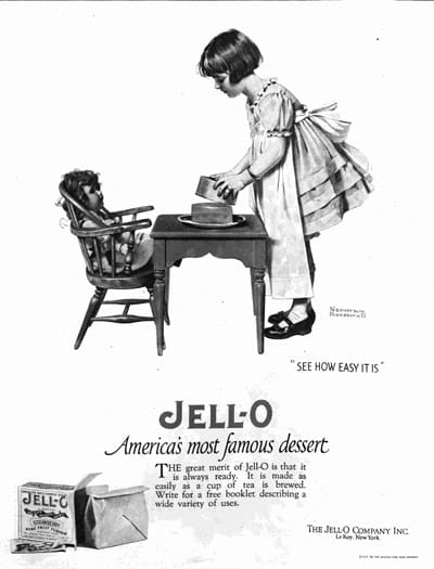
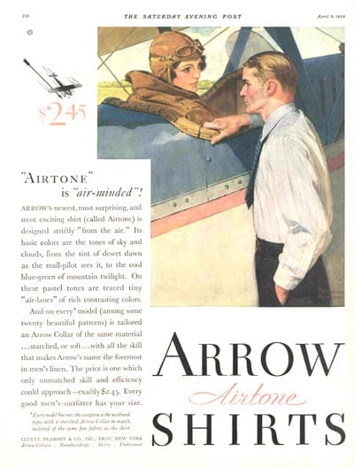
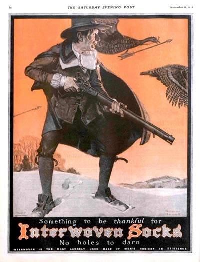
First, we’ll jump back in time to the early 21st century and Norman Rockwell’s American art. Though still often derided as an illustrator rather than an artist, Rockwell’s works adorn offices, businesses and museums across the world, and despite his reputation as a bastion of traditional American life and values, much of his art espoused radical (for the time) views. While he made his name as the artist behind the covers of the Saturday Evening Post for decades, his early career included loads of adverts. While often mocked for his lack of range, his adverts actually show a great deal of diversity. This characteristic Jell-O ad mimics the dominant style of the time, while the Arrow shirt ad flips the prevailing script by putting a female pilot in the driver’s seat. Earlier in his career, ads like this one for Interwoven Socks showcase Rockwell’s typical style that would come to characterise his career: idealised, evocative and with just a hint of comedy.
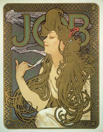
While Rockwell’s illustrationist style of art (and his close work with the Saturday Evening Post) lent itself easily to creating ads for a variety of brands, Alphonse Mucha’s distinctive Art Nouveau style did not. Czech-born but raised in Paris, Mucha was on the cutting edge of the Art Nouveau movement. While that would eventually bring him fame, when his career started, his style wasn’t accepted by the fire art milieu—a fact that eventually led him into the world of advertising and poster creation. Unlike other ads at the time, Mucha’s posters are virtually indistinguishable from his fine art work. The poster for Job Cigarettes below showcases how he used the arabesque lines and all-over pattern that defined Art Nouveau to make an ad that would not look out of place on the wall in a home of the time. And while he did eventually return to fine art, his adverts remain a stellar example of Art Nouveau making it into the mainstream.
Moving forward, there’s Dali. Master of Surrealist painting, it’s easy to forget he was also involved in filmmaking (including having been contracted to do an animated short for Disney), design (he created the Chupa Chups logo in 1969), literature (he wrote a novel as well as multiple non-fiction books), and, of course, advertising. Dali’s ads were exactly what you probably think they would be: weird, mainly off-topic, bilingual, but also something from which you can’t look away. Can you imagine being the person who agreed to this Alka-Seltzer ad?
Then, of course, hot on the heels of Dali comes Andy Warhol. A bigger household name than anyone else on this list except perhaps for Dali, Warhol’s legacy continues to be felt today in all aspects of pop culture: Campbell’s Soup is an American brand known the world over because of Warhol’s ads; the Paramount Studios logo was immortalised in Warhol’s Ads Portfolio, and Apple’s own Macintosh logo was even used in multiple colour palettes in the same series. His most popular works, though, are almost trite these days, having appeared in as many dorm rooms and fast-food restaurants as they have museums and galleries (Marilyn Monroe, anyone?). Does that make his works less important, or his legacy less profound? Of course not! But it does mean that when less accessible, harder to understand works like 66 Scenes From America enter the public eye, there is of course going to be confusion (to put it mildly).
https://www.youtube.com/watch?v=8fIfPKpY7HQ
When Burger King chose to air this ad during the Super Bowl, the US’s biggest advertising event, it was a risky decision. But how could any brand ignore footage of one of the world’s biggest artists engaging with their product? In using this footage as an ad, Burger King re-contextualises the scene, taking it from arcane performance art to aspirational marketing ploy: “eat this because a famous person ate this.” If Warhol were alive today to see it, I think he’d be particularly amused by the way the meaning has shifted. In Jorgen Leth’s original film, the focus was intended to be on the democratisation of consumer goods in the US. By using (and hashtagging!) the footage in the way that they did, Burger King has flipped that focus on its head and given us, instead, an ad all about driving curiosity, interest & aspiration among viewers. Andy Warhol, then, is the only artist on our list to ‘create’ an ad posthumously, and without a doubt the most well-known artist to be involved in advertising in the 21st century.
The last few decades have seen a shift away from the use of well-known art in adverts: while it still crops up occasionally, it’s less common today than it was forty years ago—or even twenty years ago. This fact makes the Burger King ad even more powerful: it stands out because no one else is doing anything similar right now. While not all the chat around the ad has been positive (it scored the lowest of any ad in the 2019 Super Bowl on USA Today’s Ad Meter), people are talking about Burger King, about Andy Warhol, and about the ad specifically. Warhol’s work centred on questioning norms: he questioned the concept of celebrity, art, advertising, culture, repetition and fame. So in the end, aren’t these results exactly what Warhol would have wanted from an ad including his likeness decades after his death?
Ready to change up your brand’s adverts in 2019? Elastic can help, no matter what your goals are. Contact us today to find out how!


