There’re now more than 1.5 billion websites. For a brand that wants to stand out, that’s a lot of competition. So, it’s crucial you get yours right.
But don’t worry, Elastic are here to save the day. Here are our top 6 ingredients to help ensure your website’s a success.
Trust us, we know a thing or two…
Simplicity
According to the internet, us millennials have shorter attention spans than goldfish. Frightening stuff.
That means your website needs to communicate your message sharpish. No time for waffle. The fewer words you can use to sum up your offering, the better.
You could do worse than to follow the example set by PayPal, shown below. They’ve simplified their service into 3 simple steps, using less than 50 words. Genius.
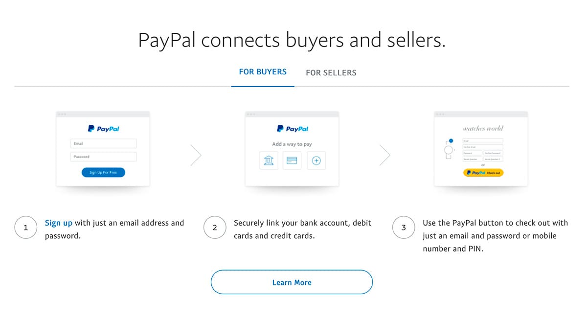
(Credit: www.paypal.com)
Consistency
You might not like hearing it, but, when people visit your website, they’re judging you. I know, it sucks. But that’s the way the world works.
If you want to be seen as professional, reputable and trustworthy, your branding needs to be consistent across every page on your website.
Take a look at the example below, from Harry’s RazorsÒ. They use just three brand colours across the entire website, giving it a professional, polished sheen that signals trust and encourages engagement.
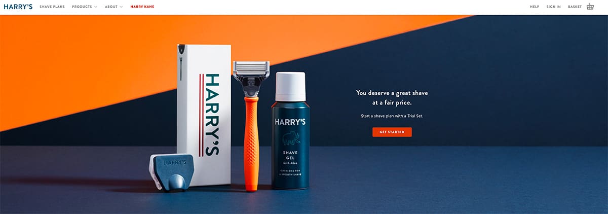
(Credit: https://www.harrys.com/en/gb)
Buttons
Buttons are everywhere. They’re on the toys we have as kids, the phones in our hands and also on most of our clothes. Let’s face it, us humans love a good button.
Make sure to exploit this when designing your website, by throwing in some buttons to guide your visitors. Want their email? Use a button. Want them to buy something? Use a button. The list goes on…
Though you’ll find buttons on most professional websites, Netflix are the masters. With a homepage that has just 15 words of content and one epic sized button, they’ve amassed over 137 million users. That’s the power of the button.
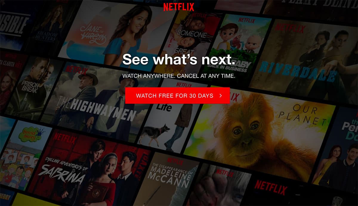
(Credit: www.netflix.com)
Icons
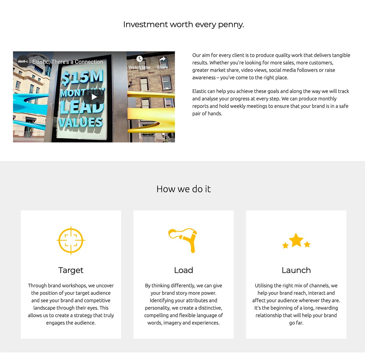
If your visitors land on a page and see a wall of text, they’re likely to yawn and then swiftly close the tab. Short attention spans, remember?
To avoid this, you’ll want to break up the content on your page using a combination of images, headers, colours, white space, and, our personal favourite, icons. It helps make everything more digestible (that’s the only food reference I’m putting in this one, promise).
Take a look at the example from our own website below. The three simple icons act as visual cues to support our message, while also making the page a lot more interesting to look at.
Navigation
Viewers shouldn’t need a degree in fine-art in order to decipher your website content and find what they’re looking for. That means overly complex, design-led websites are out. User experience should always come first.
To make visiting your website as simple as possible, you’ll need to make sure you have plenty of navigation cues on your pages. Think menu bars, page headers, imagery, and, most importantly, directional arrows.
Directional arrows guide your reader on where to go next. Take a look at this example from the website of our client The Carnegie Club. The arrow is subtle, stylish and leaves no question about what visitors should do next.
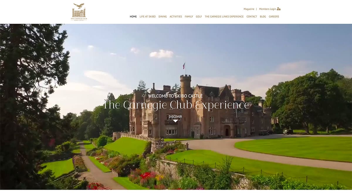
(Credit: www.carnegieclub.co.uk)
Content
There’s more to websites than just pictures, icons, buttons and arrows. There’s usually lots of words too. And the words you use will play a big part in the success of your website.
Many brands will get specialist content-writers to write the content for their website. Because there’s an art to writing in a way that engages your visitors and inspires them to do business with you.
Keep these tips in mind when writing your web content: make it clear, conversational and benefits-led. Here’s an example of what effective website content looks like from our client Sturrock Armstrong & Thompson’s homepage.
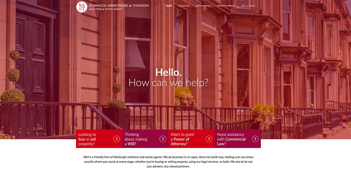
(Credit: www.satsolicitors.co.uk)
Wrap-up
There’s one thread that ties all of these tips together; you should always be focussed on making the user experience better for your visitors. If your website is easy to navigate, understand and interact with, you’ll improve your chances of turning website visitors into loyal customers. And, let’s face it, that’s the definition of a successful website.