Like many things in branding, design and marketing, there’s not a clear-cut definition of what UX design is.
In fact, if you were to walk into a room of 10 UX designers and ask each of them “so, just what is UX design exactly?” you’d get 10 different answers.
That’s not to say it’s not valuable to try and define it though. So we’ll have a go.
“UX design is an approach to designing websites, apps and products with the needs and objectives of the user in mind.
It’s about making things easy and enjoyable to use while eliminating any friction that might make the experience frustrating, underwhelming or disappointing.”
Cool, that’s a good starting point.
Let’s expand.
Defining UX design
In the marketing world, it’s rare that you’ll find a UX designer that tackles the entire UX design process.
That’s because crafting a good user experience requires input from a variety of pros with different skillsets.
This is a slight oversimplification, but you can fundamentally break UX design down into 3 separate disciplines:
- UI/website design
- Written content
- Usability
UI and website design is the act of designing app user interfaces and websites – it’s usually handled by a graphic designer.
Written content is the act of producing written material for your app or website – this is usually handled by a copywriter or content writer.
Finally, usability is the act of ensuring your website or app is functionally straightforward and enjoyable to use. While designers and writers will have input here, this stage is also informed by programmers, marketers and UX researchers.
Now let’s take a look at how each discipline contributes to the overall UX design process.
UI/website design
An app’s user interface or a website’s design play an integral role in the overall experience a user has.
If they’re visually unappealing, or worse, visually difficult to look at, then users are unlikely to have a positive experience.
This, in turn, is going to put them off using your app in the future or returning to your website.
Obviously not the result you’re looking for, so it’s important you get them right.
Here are a few of the UX considerations UI/website designers take into consideration when designing for an optimum user experience.
Layout
This refers to the way information is laid out on the screen.
If your information is laid out in an unstructured way, it’ll be messy and convoluted – which can make it difficult for the user to navigate.
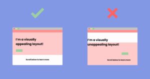
Check out the examples below:

The example on the right has an unstructured layout. Not only is it ugly to look at, but it’s also visually confusing.
The example on the left, however, has a clearly defined structure.
It’s easier to understand, tidier and more pleasing to look at – which, ultimately, will lead to a better overall user experience.
Typography
Designers will also make typographic decisions to aid the user experience.
Elements like font-size and font-style have a big impact on how accessible your project is to users.
If you choose a font-size that’s too small, for instance, it’ll cause your reader to squint when they’re reading your content. As shown in the examples below:

No matter how great your written content is, if the user has to squint to read it, they’re not going to enjoy the experience as much as they would if the font-size was bigger and easier to read.
Remember, the goal of the UX designer is to make the experience as frictionless as possible.
As well as font-size, designers also have to consider the font-style they use.
Not all fonts are created equal – some fonts, despite being simple, make for a great user experience as they’re easy to read.
Other fonts are prettier to look at, but much more difficult to read – and therefore detrimental to the user experience.
Check out the example below:

The example on the left uses a popular Webfont. And, while it’s not super visually interesting to look at, it’s very easy to read.
The example on the right, however, has more personality and it’s prettier. That said, it’s also more difficult to read, so the user will have to strain harder to try and decipher it.
Colours
Designers are also responsible for determining the colour combinations used on a website or app.
Colour choice is important for a number of reasons.
Firstly, different colours are known to have different psychological effects on us. So, colour choice will be heavily influenced by how you want your users to feel.
Then, from a functional point of view, colours determine how easy a website or app is to read. Check out the example below:

In the left example, there’s a distinct colour contrast – black on white – that makes the content incredibly easy to read.
The example on the right, however, has a less distinct colour contrast – black on dark grey. This is much harder to read, which has two key drawbacks:
- The user will have to strain in order to read the content, and
- Due to the lack of contrast, the user might miss important content altogether!
Styles & interactions
Finally, designers also have to take into account the overall visual style of the project.
They need to decide:
- Whether the user will benefit from illustrated content, photography or a combination of both
- Whether the user will prefer interacting with static images, animated gifs or video content
- What type of iconography will make the website easy to quickly understand and navigate
They’ll also need to consider the various interactions that occur. Below is a list of common interactions designers consider when designing for UX:
- Do call-to-action buttons change colour on hover to clearly indicate they’re clickable?
- Do elements of the page change as the user scrolls up and down?
- Does the navbar need to stick to the top of the screen when the user scrolls so they’re always easily able to navigate to a different part of your website or app?
Written content
With design taken care of, let’s take a look at how to optimise written content to enhance user experience.
At the beginning of this article, we highlighted that an important element of UX is taking the users needs and objectives into consideration.
As a copywriter or content writer, you’re going to need a pretty detailed understanding of those needs and objectives to ensure your written content is up to scratch.
Here’s an example.
Let’s say you’re writing content for a car sales website.
As a car enthusiast, you might want to write content about all the things you love about cars: different types of exhaust, engine-size, types of polish, etc.
While this might be great, well-written content, unless your user is also a car enthusiast, it’s unlikely to interest them.
Instead, they’re probably more interested in finding out about which cars are the most economical, are most suitable to a family or have the best dashboard features they can brag to their friends about!
This is the information they need in order to make a purchase decision.
So, in order to ensure a positive user experience, you’ll need to make sure you include it on the website.
As well as what content is written, a content writer also has to consider how it’s written.
They need to think about things like:
- Readability – Is it easy to read, or will the user need a master’s in linguistics to understand it?
- Tone-of-voice – Will the user respond better to a fun style of writing, an informative style of writing or a compassionate style of writing?
- Content length – Does the user prefer long, informative content or do they prefer short, snappy content that’s easier to digest?
Getting the balance of these elements right is integral to ensuring your user has a frictionless, enjoyable experience on your app or website.
Usability
The final discipline we’ll cover in this article is usability, which is probably the most important element of UX design.
You could have the most beautiful website in the world, with the most eloquently written content, but, if the website or app isn’t usable, it’ll ultimately bomb.
That’s why an ugly website like Craigslist is still one of the most visited websites on the internet.
It might not be pretty to look at, but functionally, it’s incredibly easy-to-use.
As mentioned earlier, usability is often informed by both designers and writers.
If your website is pretty to look at and easy to read, it’s immediately going to be more usable.
But usability is also informed by other members of the UX design team – such as programmers, marketers and user researchers.
Programmers, for instance, will look at how to make the app or website stable, fast and reliable. All of which contribute to improved usability.
Marketers will look at things like site-maps, information layouts and user journeys.
While we’d need a separate article to cover all of these subjects in-depth, a simple way of defining them is that they make it easier for a user to find what they’re looking for.
If you were designing an eCommerce website, for instance, a marketer would look at how best to layout your navigation bar so that a user could easily navigate to any product in your catalogue at the click of a button.
This might sound basic, but you’d be surprised at how many eCommerce websites actually get this part wrong.
Finally, user researchers will use various tools to monitor how users interact with an app or website.
They’ll also conduct surveys – as well as onsite and in-app questionnaires – to talk to users about what they like and dislike about the UX.
They’ll then collate this information and pass it on to the UX team to implement into future iterations of the app or website to improve the user experience further.
Wrap-up
There you have it, a quick introduction to UX design.
While it’s not totally comprehensive – we’ll be creating more posts that expand on the topic in the future – hopefully, it gives you a good basic understanding of UX design and what it entails.
Finally, if you’re looking for more content to beef up your UX knowledge, make sure to check out our guide to web design and our tips for writing more impactful content.
Liked what you read and think others would too? Then make sure to use the social links below to share with your peers!


