When most people think of branding, they think of logos, colour palettes, and straplines. Rarely do they think about logotypes. Yet typography is one of the most powerful tools at your disposal. It’s the voice your brand speaks with before anyone reads a single word. And if your lettering looks like everyone else’s, your brand sounds like everyone else’s.
That’s why a bespoke logotype isn’t a nice-to-have. It’s a serious brand investment. It’s the difference between being remembered and being overlooked on a crowded high street or busy LinkedIn feed.
Why typefaces matter more than you think
Walk through Edinburgh, London, or Manchester and you’ll notice the strongest brands don’t just write differently, they look different. Typography is identity. It carries tone and character. A playful rounded logotype says, “We’re friendly and creative.” A sharp serif says, “We’re established and trustworthy.” A blocky voxel-style font says, “We’re about gaming, worlds, and imagination.”
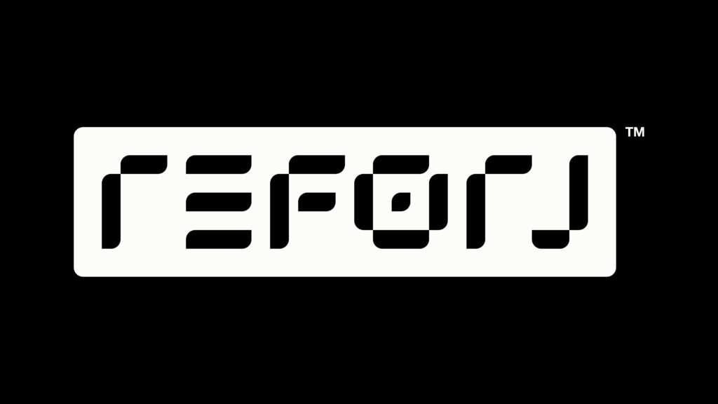
That last example isn’t hypothetical. Elastic Creative’s work for Reforj, a new game from 4J Studios, is a masterclass in using typography to capture spirit. Reforj is all about reclaiming, rewriting, and reforging a voxel-based world. Elastic designed a custom typeface that reflects that blocky, dynamic universe. The type doesn’t just spell the name, it embodies the game itself.
When you see the Reforj logo, you don’t just read it. You feel it. That’s what a bespoke logotype does, it creates emotion at a glance.

Start with story, not style
The first mistake brands make is picking fonts because they “look nice.” Fonts should never be about taste. They should be about story. Reforj’s brand narrative was clear: bold, imaginative, adventurous. That gave Elastic a foundation to work from. Every curve, every edge of the typeface was informed by the game’s DNA.
If you’re a financial firm, your story might be about trust and reliability. If you’re a craft gin distillery, it might be about heritage and character. If you’re a fashion startup, it might be about rebellion and attitude. Start there, and your typography will follow naturally.
Make it versatile
A custom typeface is no use if it only works on a billboard. It needs to perform everywhere: on your website, in an Instagram story, on printed stationery, or across a T-shirt. Elastic’s work for Reforj understood this. The typeface had to scale from a console splash screen to a hoodie graphic without losing clarity.
This is where many off-the-shelf fonts fall down. They may look fine on a laptop, but unreadable on mobile. Or they might work for a wordmark, but not for a headline. A bespoke logotype avoids those pitfalls because it’s engineered to serve your specific needs.
Don’t be afraid to stand apart
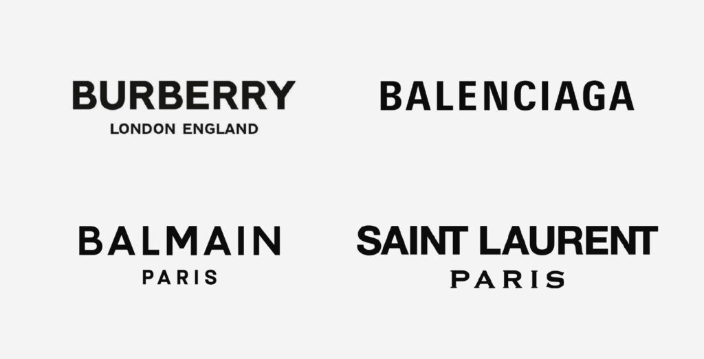
There’s a reason so many brands end up in Helvetica, Arial, or another “safe” sans serif. They’re functional. They don’t offend. But they also don’t inspire.

Elastic has long championed what they call “elastic thinking”, a willingness to break from the safe, scripted responses that make brands blend into the background. Typography is one of the most effective ways to do that. The Reforj logotype isn’t just functional – it’s distinctive. You know it’s Reforj before you even process the letters.
That’s the power of standing apart. A bespoke crafted logotype signals you’re not following the herd. You’re making your own rules.
Test it in the wild
Designing a logotype is one thing. Living with it is another. You’ll need to test it rigorously – on signage, in emails, on social posts, in print, even in motion graphics. Does it stay legible? Does it still feel like you when shrunk down or blown up on a banner?
Elastic Creative made sure Reforj’s logotype held its own across every touchpoint, from the dynamic logo to in-game teasers to Pioneer Programme merchandise. That kind of testing is what transforms type from a design asset into a true brand voice.
The silent ambassador of your brand
Done well, bespoke typography can become iconic shorthand for your brand. Think of Coca-Cola’s flowing script, or the BBC’s blunt blocks. Elastic’s work for Reforj is the same principle, custom lettering that instantly evokes a world, a culture, a feeling.
This is why bespoke logotypes are worth the investment. They last. They carry meaning. They make you memorable.
Final thought
If you want your brand to stand out, don’t let your voice sound like everyone else’s. Start with your story, design a logotype that embodies it, make sure it’s versatile, test it in the real world, and commit to standing apart.
Elastic Creative’s work shows how it’s done. Reforj’s custom logotype doesn’t just spell the brand, it speaks it. That’s the goal. Because in branding, the way you say something is just as important as what you say.


