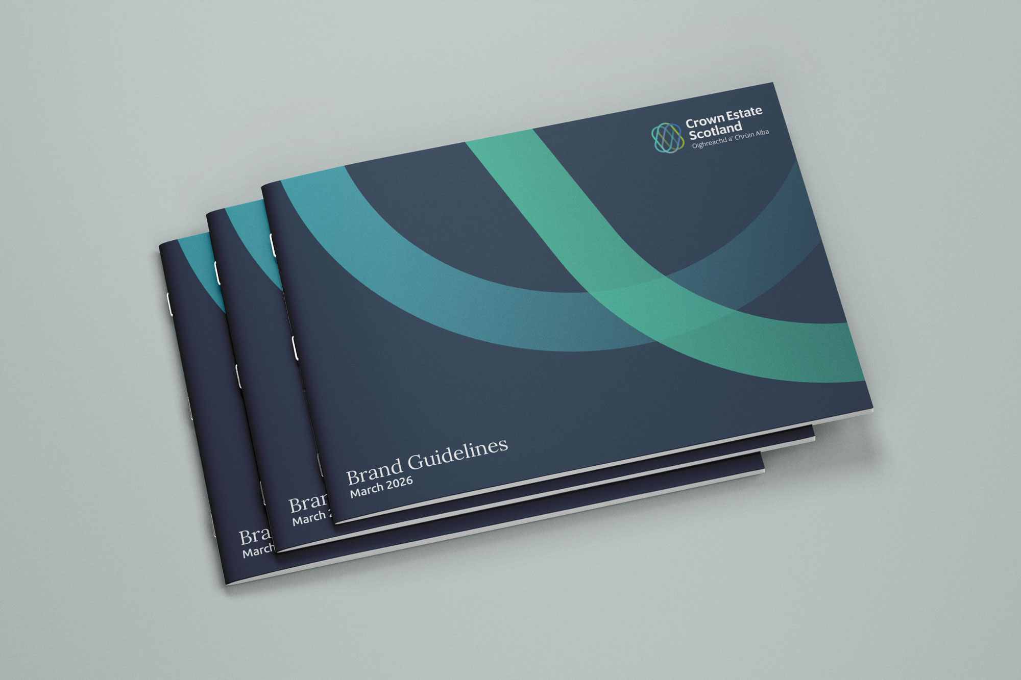
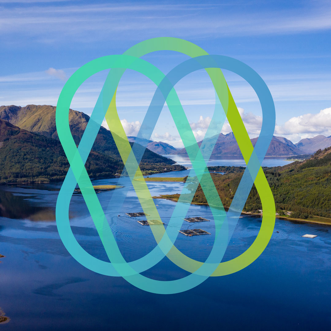
Crown Estate Scotland manages a £665 million portfolio that stretches from salmon rivers to offshore wind farms, from rural estates to harbour moorings. Few people ever see it as one connected story. We were appointed to lead a full brand refresh, creating a visual identity elastic enough to hold that complexity together while always feeling unmistakably Crown Estate Scotland.
Crown Estate Scotland
Creative approach
Every brand refresh starts with listening, not designing. We began with a Brand Strategy Workshop bringing together Crown Estate Scotland’s key decision makers, mapping stakeholder needs across government, staff, partners and the public, and identifying what was working in their existing materials and what wasn’t.
From that foundation we developed an elastic creative concept: a visual and verbal language flexible enough to serve every corner of the portfolio without losing coherence. We built out the refreshed identity system, tested it against real assets, and presented the creative vision back to the Crown Estate Scotland team for discussion and approval before moving into full development.
Throughout, our focus stayed on connectivity. Coastal communities and the energy transition. Rural land management and biodiversity. Commercial development and community wealth. The brand needed to make that complexity feel navigable rather than simplified, giving every audience a clear way in.
"Every step of this process has been first class, from the way you handled our stakeholders while collecting their feedback, to the superb visual concepts you created, to the diligent way you have closed out all the deliverables in the last few days. This is the best experience I've had working on a project with an agency."
Dave Shedden
Senior Corporate Affairs Manager
Brand Colour Palette
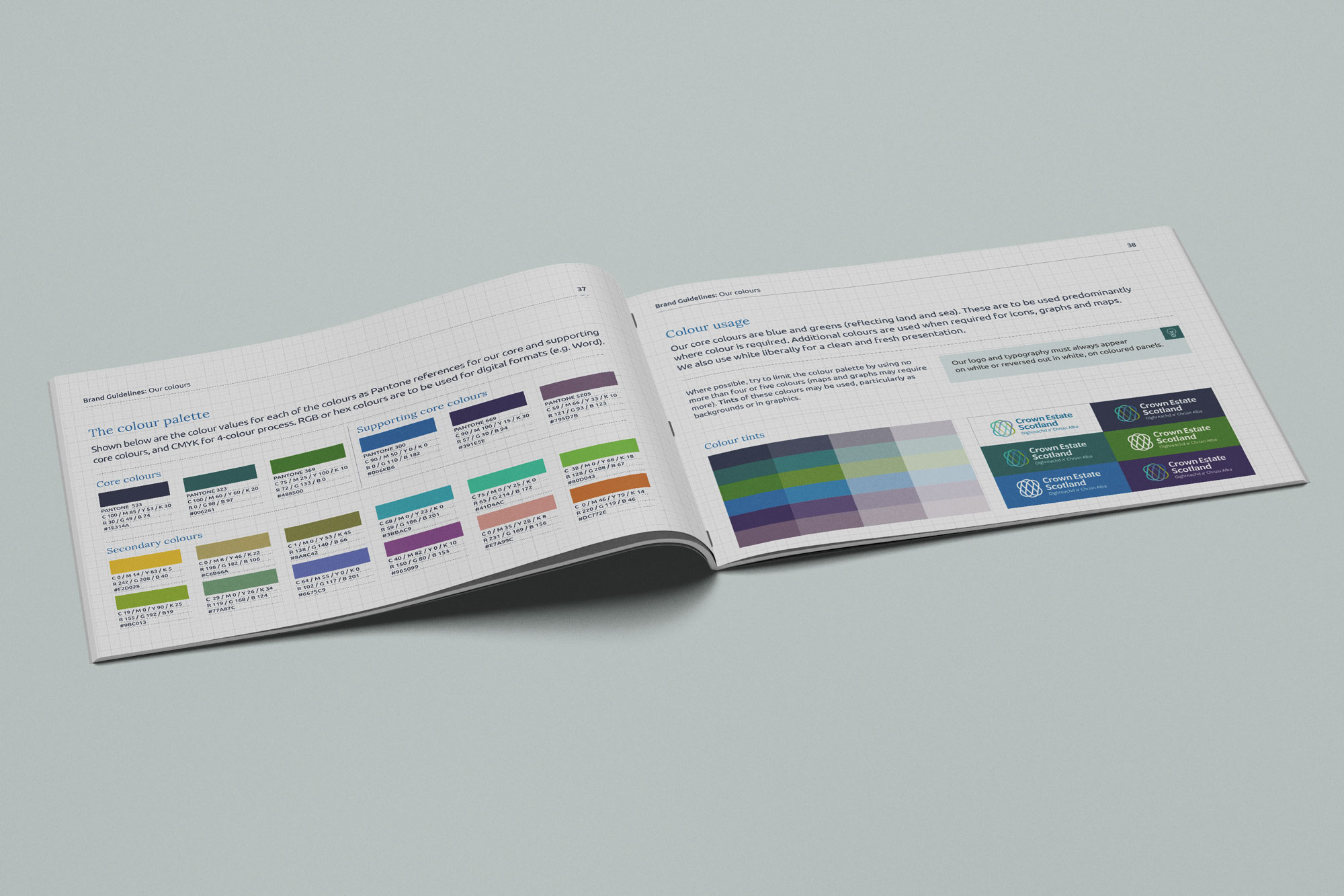
The refreshed palette centres on two core colours, blue and green, reflecting land and ocean, the twin territories at the heart of Crown Estate Scotland’s portfolio. These carry the majority of colour usage across the brand. A wider supporting range brings life to panels, illustrations, graphs and maps, while white is used generously throughout for a clean, fresh presentation that lets the photography and content lead.
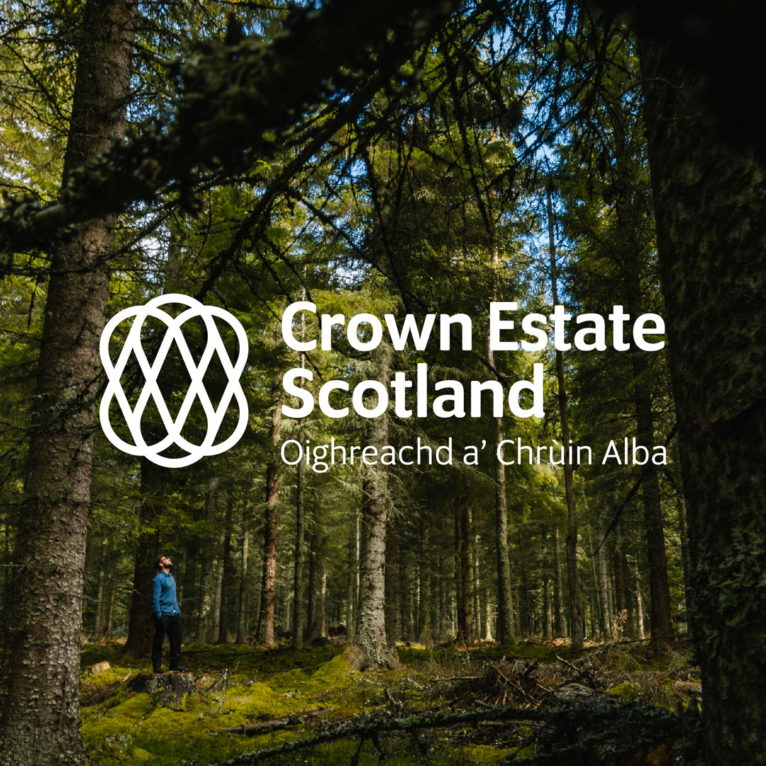
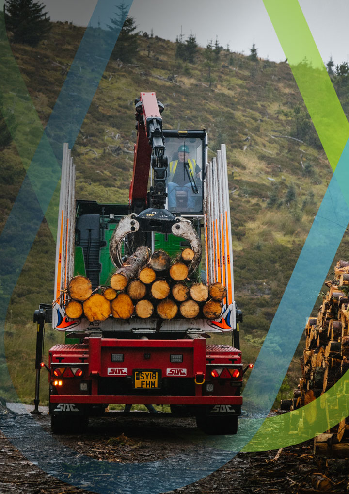
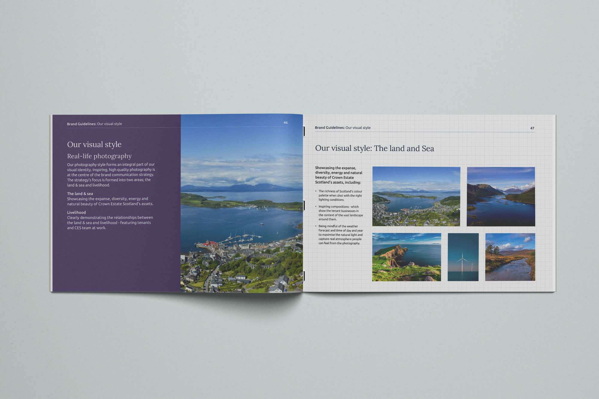
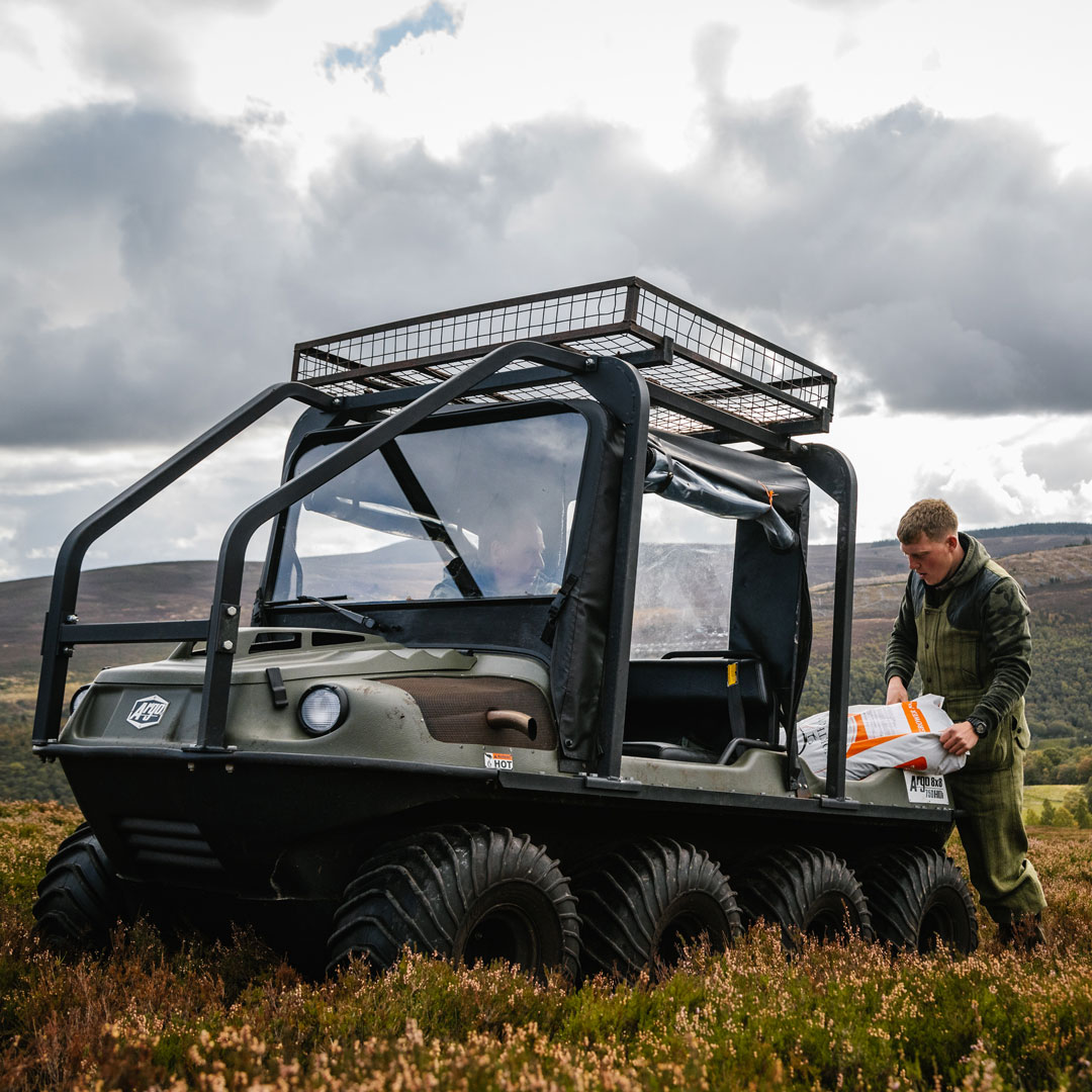
Photography plays an equally central role, built around two themes: the land, capturing the scale, diversity and natural beauty of the assets themselves, and livelihood, showing the tenants and teams whose work connects people to that land. Real weather, real light and real moments of pride and graft, never staged.
The outcome
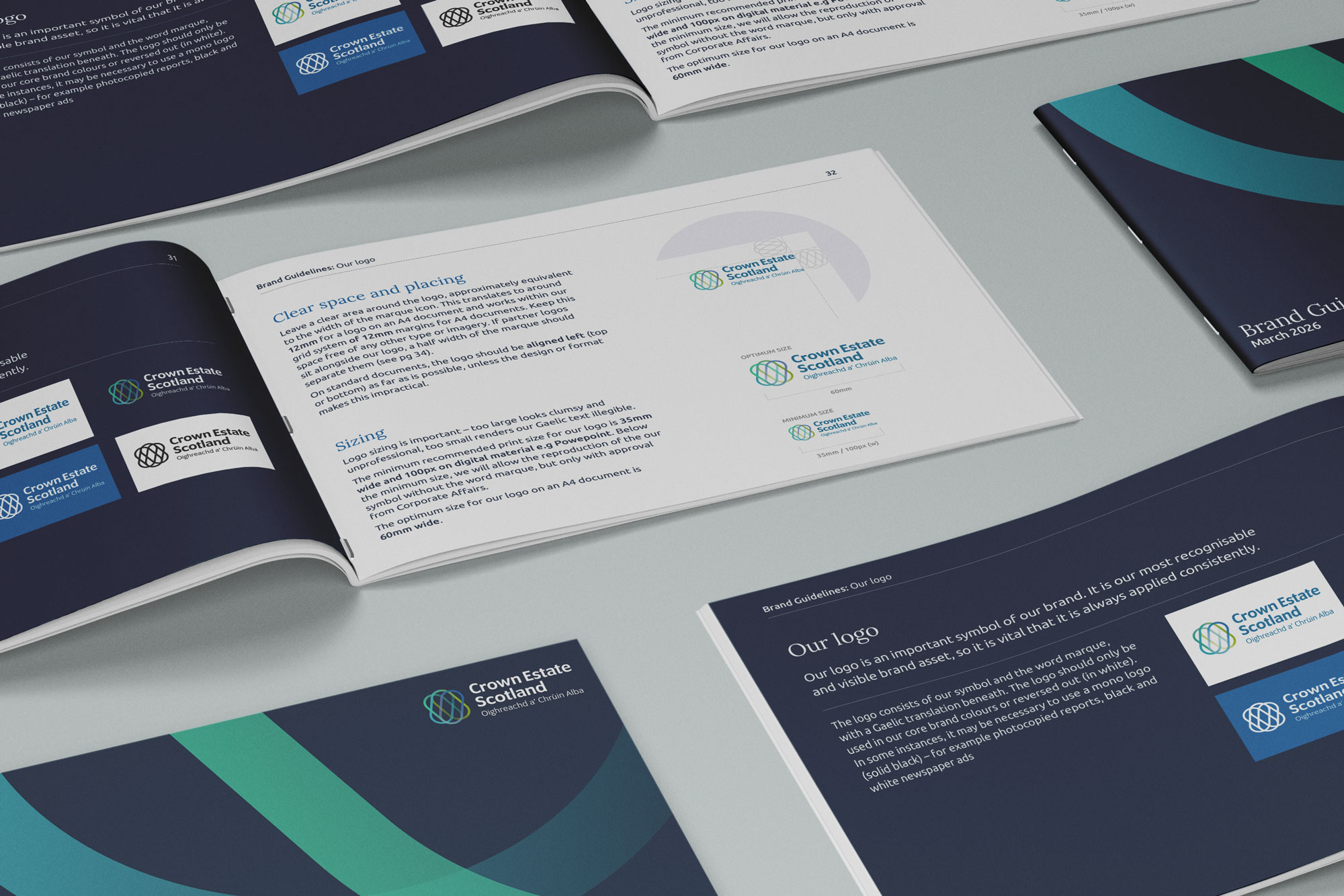
The result is a brand refresh built to work as hard as the organisation it represents. An updated visual identity, photography direction, tone of voice and brand architecture now give Crown Estate Scotland a consistent way to speak to Government, staff, partners and the public alike.
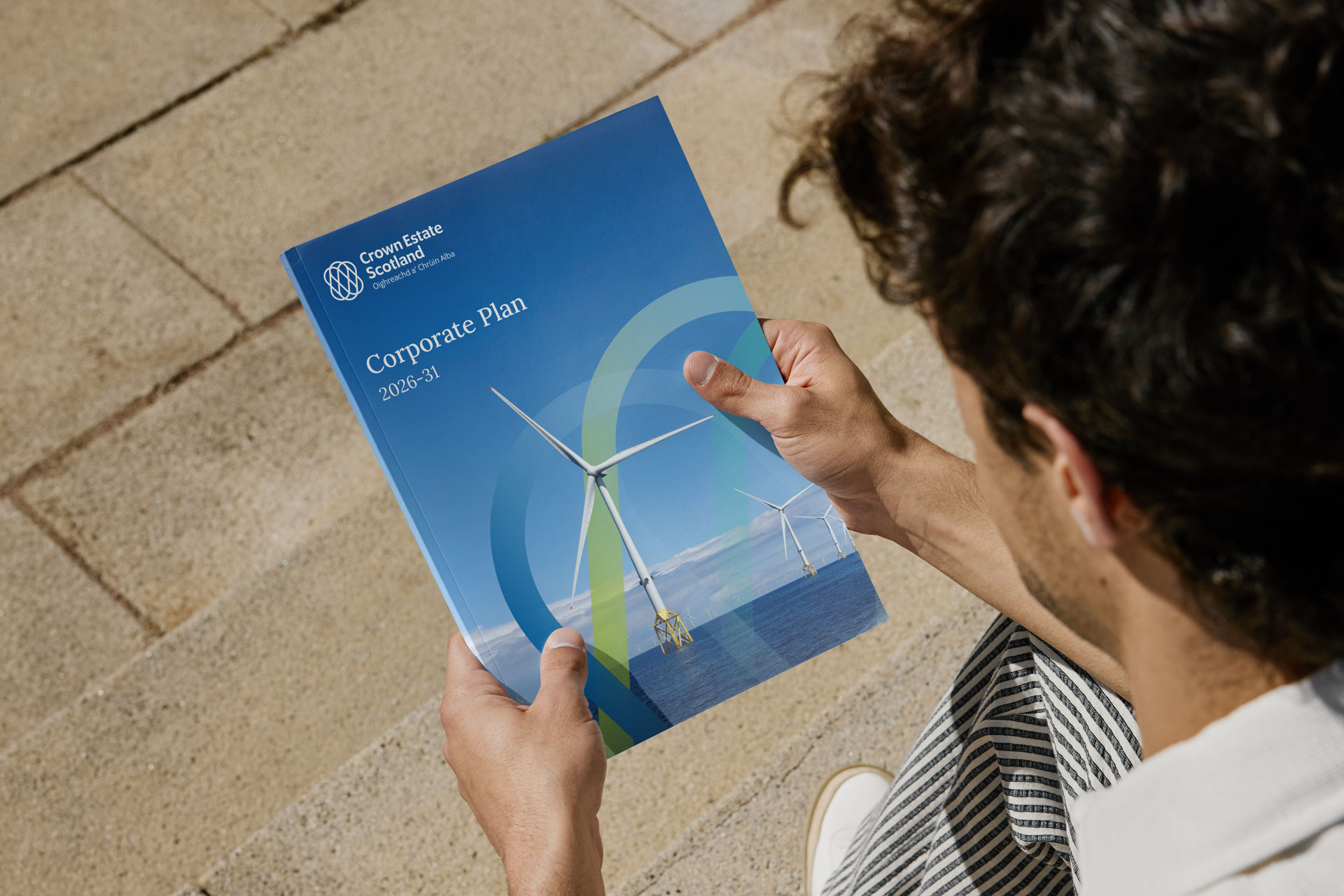
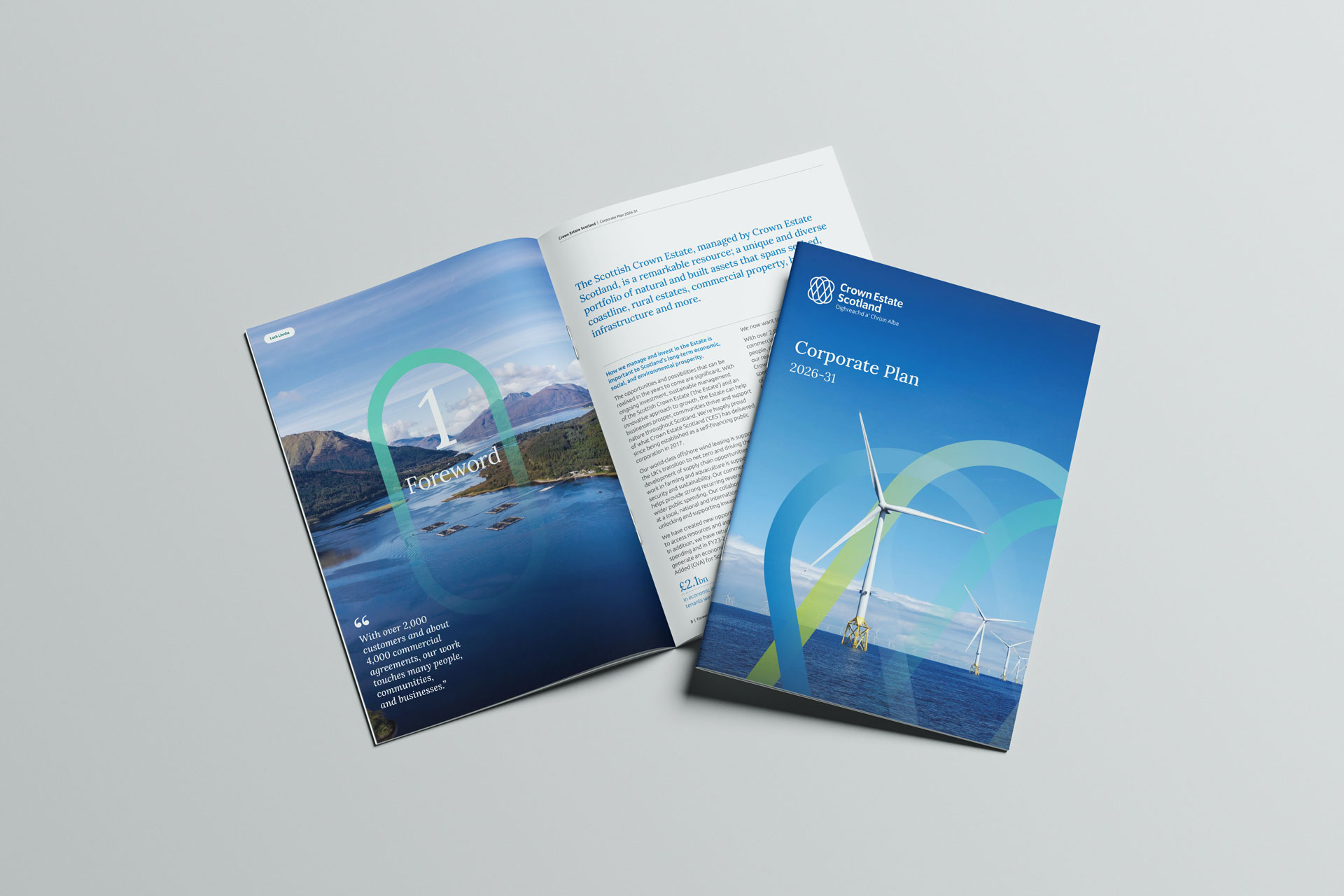
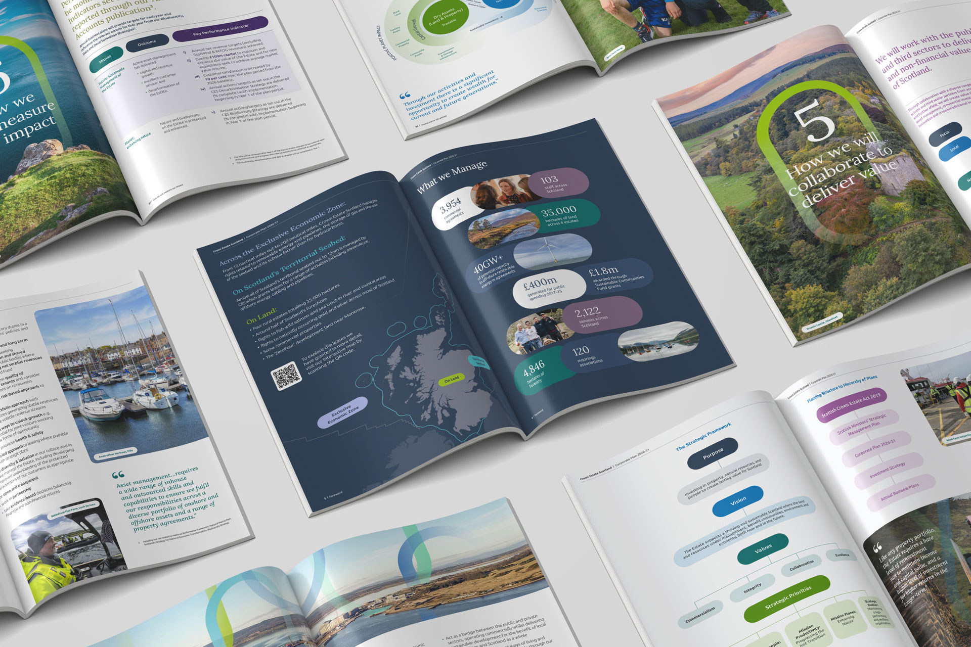
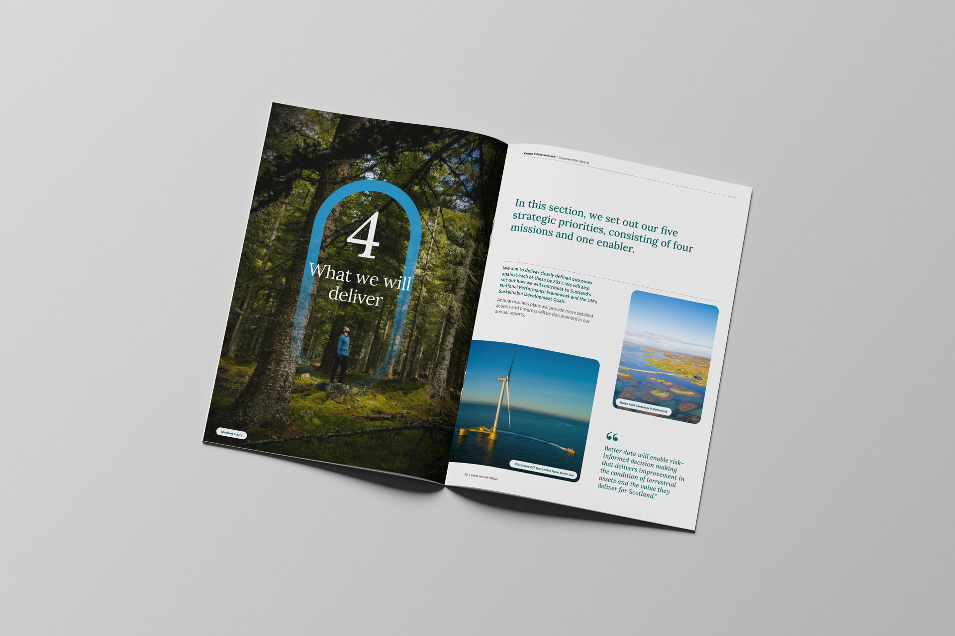
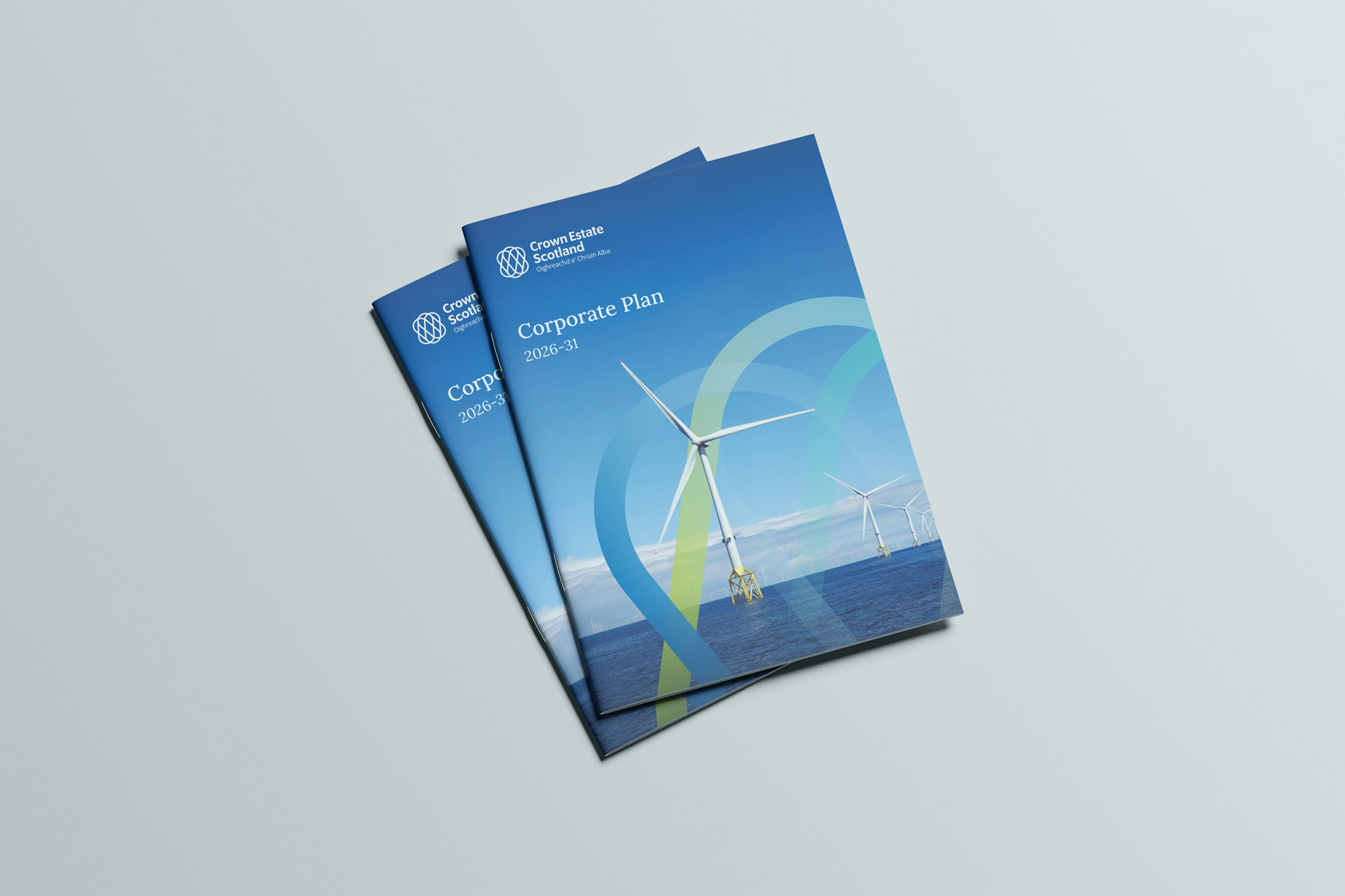
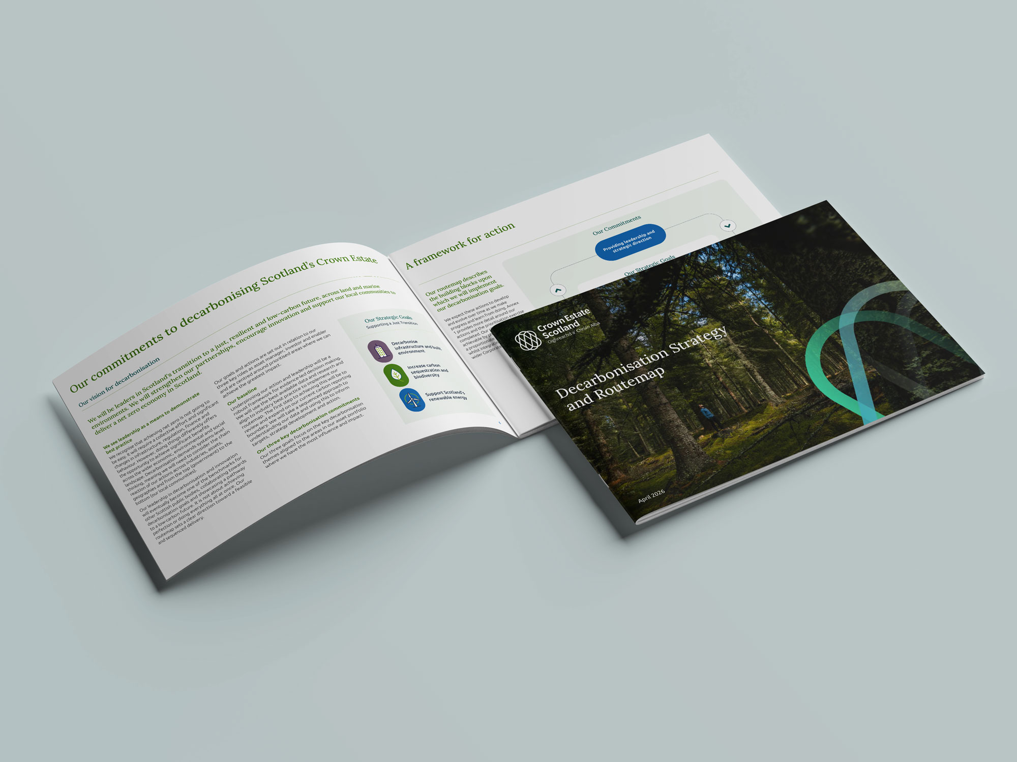
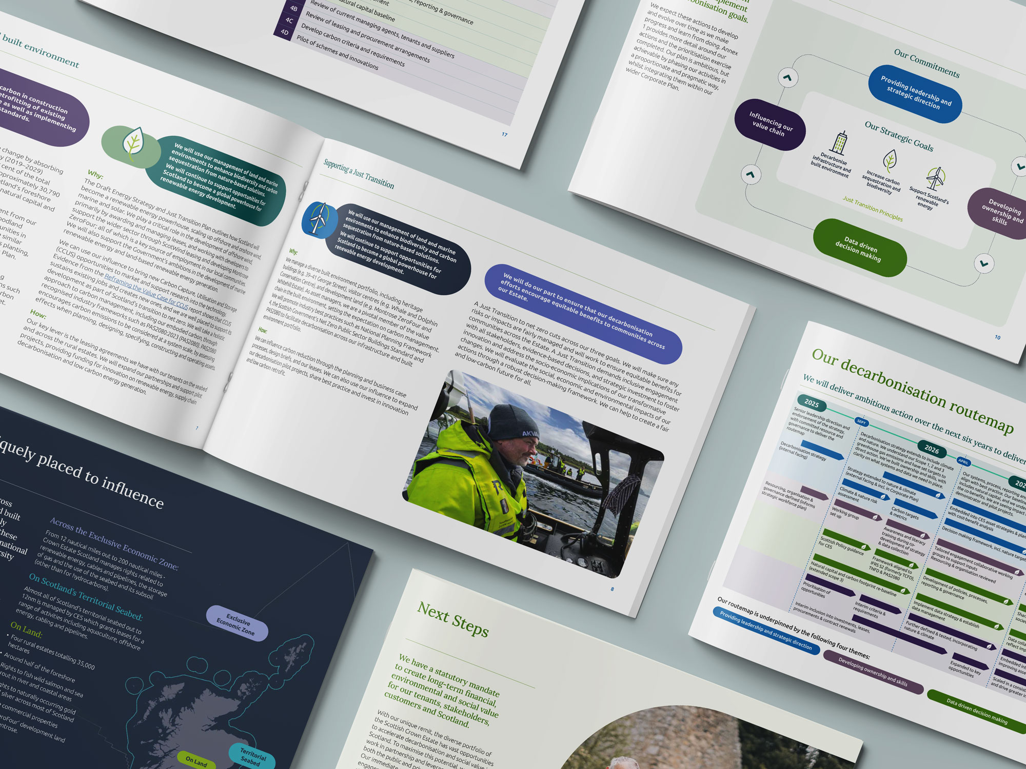
That new identity comes to life first in the 2026 to 2031 Corporate Plan, Crown Estate Scotland’s flagship publication, designed to showcase the refreshed brand while communicating strategy with clarity and authority. It continues into the Decarbonisation Strategy, translating a complex, high stakes commitment into a document as considered and confident as the ambition behind it.
Together, these deliverables give Crown Estate Scotland a design look and feel that finally matches the scale and relevance of the organisation as it operates today.