The Desert Island Discs format has sailed along the airwaves around the UK, and indeed the world, for many years. It’s a tried and tested snapshot into the thoughts and lives of those who venture onto the show, so it was only natural that we’d pay homage to it in our own creative, way. We asked our studio to pick one piece of artwork and one piece of design that would help them (or keep them going) if they were marooned on a desert island. From Bauhaus to a coconut, the answers were quite surprising!
Who?
Guy
, Creative Director
Art Piece:
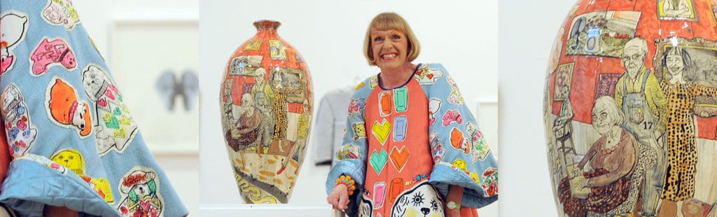
A Grayson Perry Vase.
Why?
Fab to look at and could hold all my rainwater.

Design Piece:
Cococrack: The Easy Way to Coconut.
Why?
Form and function- what more can I say!
Who?
Arron
, Senior Designer
Art Piece:
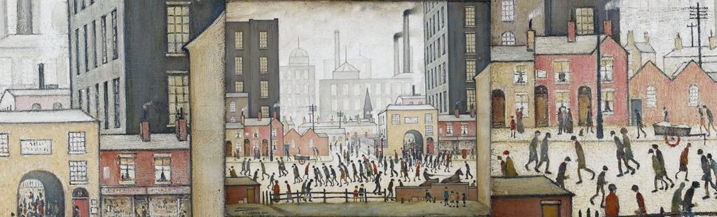
Coming from the Mill, L.S. Lowry (1930)
Why?
Growing up in Oldham, Manchester, I remember seeing scenes a lot like these, crowds of people trudging along beneath chimney-filled grey skies- albeit fewer horse and carts and less smoke since the decline of the Industrial Revolution. The desaturated colour palette, naive-style ‘matchstick men’ and busy composition evoke a sense of home like nothing else. If anything could make me thankful for washing up on a desert island, it’s a bleak reminder of where I came from.
Design Piece:
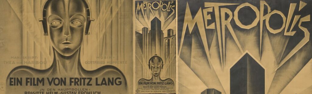
Metropolis Theatrical Poster, Heinz Schulz-Neudamm (1926)
Why?
I’ve always loved the poster for this iconic silent sci-fi movie classic, featuring Maria the Maschinenmensch beneath a dark, towering cityscape. As a graphic designer, its angles, monochromatic colour palette, custom lettering, striking contrast and unusually tall format are very appealing. An original lithograph print recently sold for over $350,000!
Who?
Blair
, Digital Marketer
Art Piece:
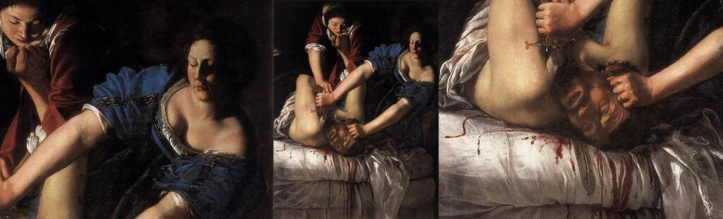
Judith Beheading Holofernes, Artemisia Gentileschi (c. 1615)
Why?
If I was going to be stuck on a desert island, I’d want something to remind me to be tough, so I’d choose Judith Beheading Holofernes. From the subject matter (a guy getting beheaded, come on!) to the artist herself (one of the first really well-known female artists in history), this painting gives me all kinds of inspiration to do what has to be done, even if it’s, well, pretty gross.
Design Piece:
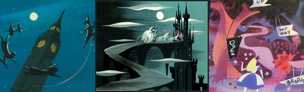
Mary Blair’s illustration work
Why?
Mary Blair’s iconic Disney illustrations are vibrant, evocative and relentlessly happy, even when they depict a dark or eerie scene- all of which would be useful on a desert island. Plus, though it all looks quintessentially mid-century, there’s a magical timelessness about it that means, to me at least, it never gets old.
Who?
Alex
, Managing Director
Art Piece:
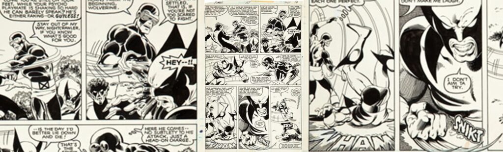
John Byrne’s comic book illustrations
Why?
Byrne’s run on the X-men created the fanbase that remains to this day. Comic book art is probably my favourite form and he was the best of the best, bringing a real design sensibility to his artwork. There’s a real life and excitement to his compositions.
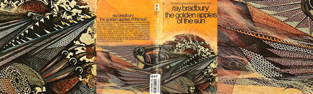
Design Piece:
Ian Miller’s book illustrations
Why?
Miller drew book covers for Ray Bradbury, among many others, in the 1970s. I love the way he blends the organic with the metallic. His imagination is incredible and he creates images that appear to capture dreams, and to be reminded of one of my favourite authors too? Bonus!
Both examples I would consider a skilled combination of art & design. Comic books, book covers, record album sleeves or posters- I most appreciate when an artist is also a designer looking to interpret an idea that has a story behind it, whether it be a concept album or a novel.
Who?
Michael, Digital Strategist
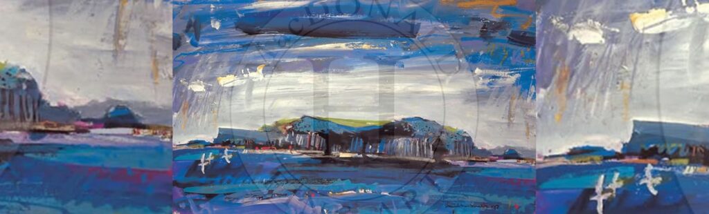
Art Piece:
Staffa, Fingal’s Cave, Hamish MacDonald
Why?
I love his style and also the use of collage, mixing in type and random words into his paintings. Very much in the Scottish Colourist tradition with its expressive, vibrant blues and strong brushstrokes. I visited Fingal’s Cave last year and it was stunning. MacDonald’s painting really captures the emotions I felt when visiting.
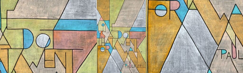
Design Piece:
Paul Klee’s design philosophies, like this quote captured in true Klee-style by Dangerdust.
Why?
I really identify with the ‘take a dot for a walk’ philosophy.
Who?
Jacob, Motion Designer
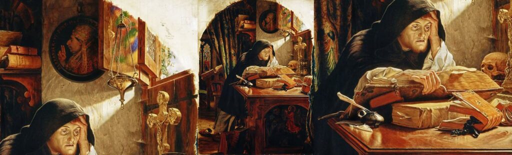
Art Piece:
Dawn: Luther at Erfurt, Sir Joseph Noel Paton
Why?
This is one of those paintings that rarely leaves my mind, rattling around everyday and long into the night. Countless hours have been spent in the gallery staring at it, the dusty desk, the warmth from the window. The expression all too often reflects mine, especially before I’ve had a coffee in the morning.
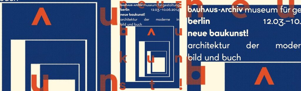
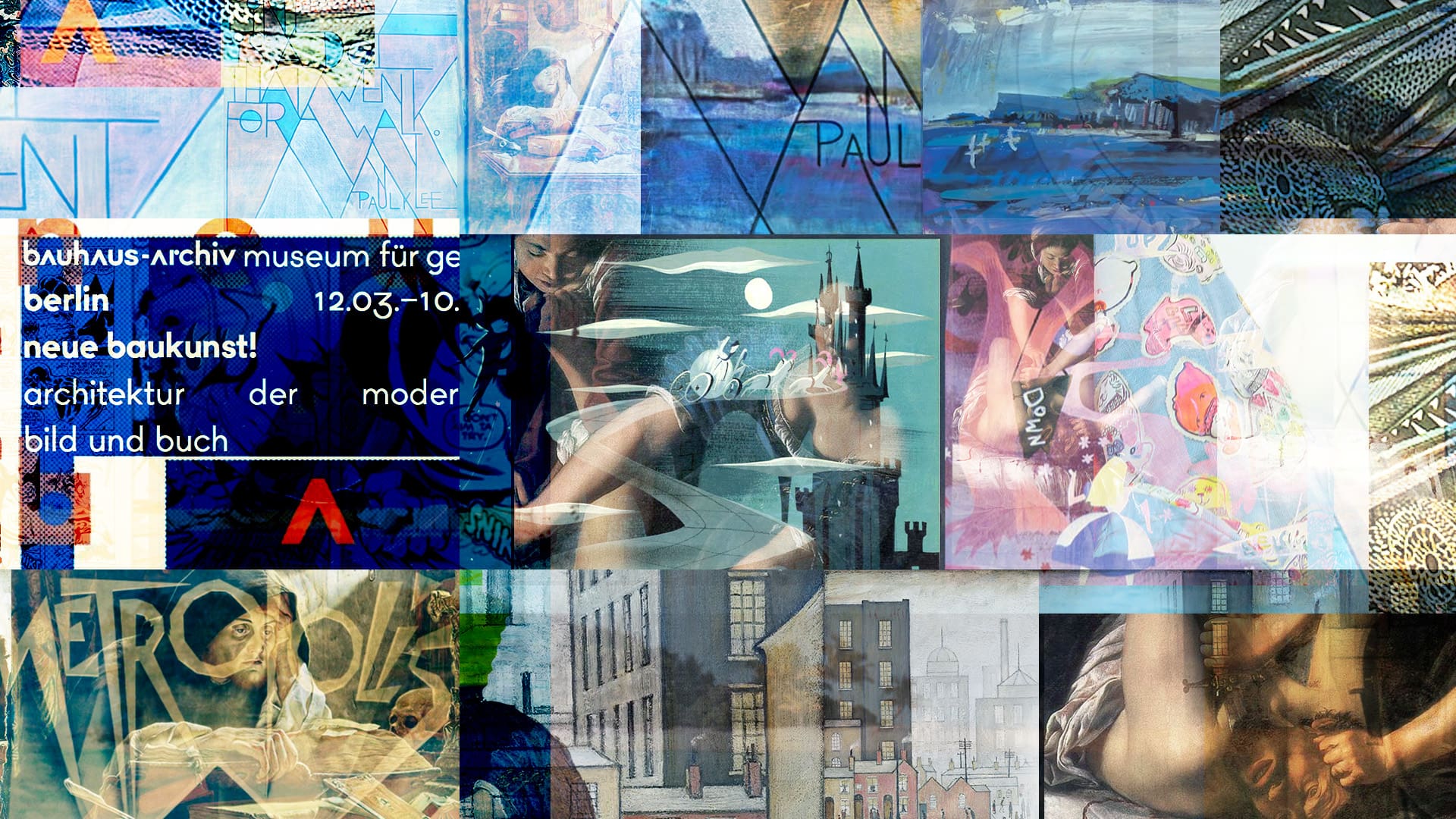
Design Piece:
Plakat Neue Baukunst, Sasha Lobe
Why?
I managed to go the exhibition this poster is for back in 2014. The poster itself draws upon that very influential part of design history, and seeing it around Berlin plastered on walls, doors and floors added to the whole awe of it.

As you can see, we’ve assembled an eclectic collection spanning 400 years of art & design history- a perfect representation of our interests, experience & ability