In the not-so-distant past, Airbnb thought this logo was cool.
![]()
Shocking stuff. Can you imagine a logo like that doing well in 2019? No, me either.
Design trends move fast. So, as marketers and business owners, it’s important to keep up with what’s cool and what’s not. Otherwise we run the risk of becoming outdated: the digital equivalent of the plague in the modern business world.
Maybe you’re in the midst of a rebrand and looking for inspiration. Maybe you want to freshen up your marketing content. Maybe you just hate following trends and want to find out what not to do. If you’re trying to keep your business relevant, this post is for you. So, let’s get to it. Here are 6 of the hottest 2019 graphic design trends.

Minimal meets bold
2018 saw the minimal design style reach its peak. It was all about sleek font-types, single-line illustrations and stripped-back harmonious colour schemes.
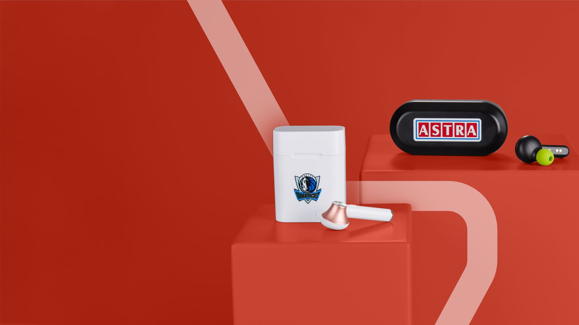
This year, though the stripped back design elements of minimal are still popular, pastel colours have been dropped in favour of bold, vivid colors.
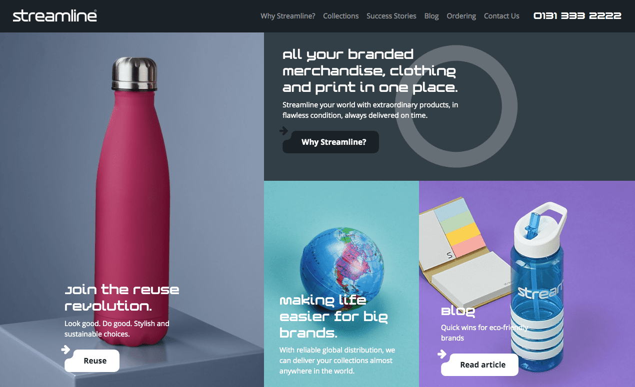
Here’s an example from the recently launched Streamline website:
And another from our client ETB:
Though the design-elements in these creatives aren’t overly complex, they’re brought to life by the use of vivid, eye-catching colours.
From a visual communication perspective, this makes them much more likely to stand out and attract attention.
Because of this, it’s a particularly useful style to use for social media and programmatic campaign ads, where attention is given to the brands with the boldest design work.
(Click here if you want to learn more about how to make your social media work harder for you.)
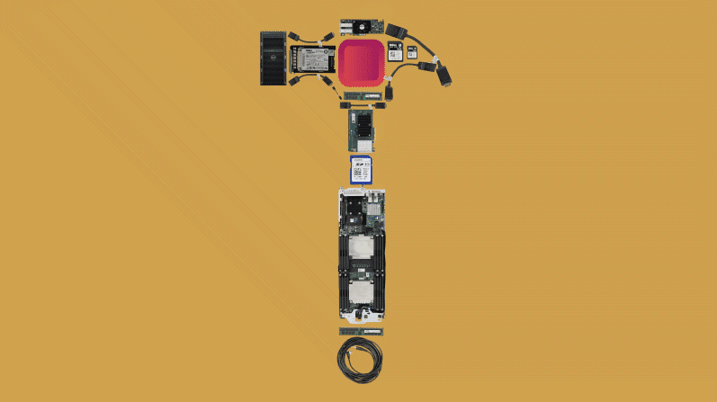
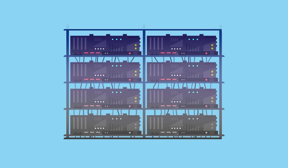
Isometric images
The best way to describe isometric design is that it’s like the love-child of 2D and 3D.
It’s drawn in 3D. But, since no converging perspective is used, it has the look and feel of a flat design.
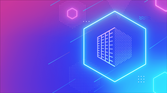
Here’s some examples from the CDS website to help you make sense of it.
First, 2D or “flat” design:
Then 3D design:

And, finally, here’s an isometric design:
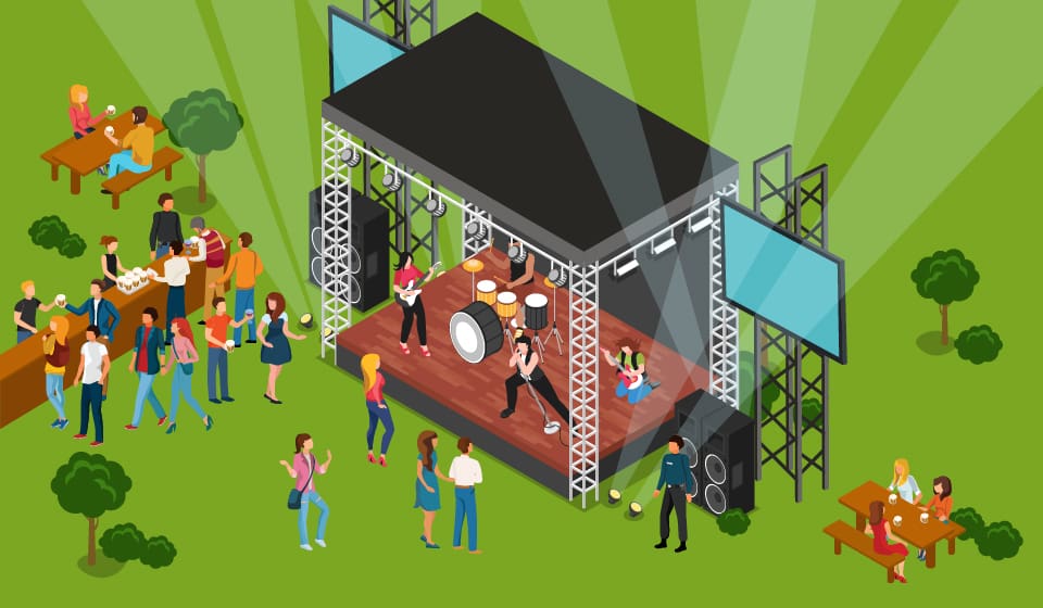
While this style is being used in everything from blog images to infographics, this year it’s particularly popular on landing page hero images.
This is most likely because the “top-down” view gives designers more communicative power. So they can convey more information with more accuracy than they would be able to do with the same amount of space in a perspective-based 2D or 3D image.
Motion graphic logos
I hark back to the fact that the average human attention span is decreasing in at least every other post I write, and with good reason. That fact should affect every decision we make when it comes to modern digital marketing. Design is no exception.
Decreasing attention spans could explain why there’s an emerging trend towards motion graphic logos. It’s no longer enough to have a static logo design. It needs to move if you want to grab your audience’s attention. Here’s a couple of examples from clients we’ve worked with.
First, ETB:
Now, HSPC:
And Broker Insights:
Finally, TJ Ross:
The great thing about motion graphic logos is that they offer users a much more interactive design experience.
It makes your logo interesting, engaging and more likely to be remembered, too. Perfect if you’re trying to steal attention in a competitive marketplace.
Variable fonts
If you frequent the Elastic site, you’ll already know we’re big fans of mangling up fonts.
Although we’ve been doing it since before it was cool, in 2019 it’s trendy to stretch, distort, blur and slice fonts to make them more interesting.
It’s also a great way to enhance the message you’re trying to convey.
Take this example, from our client Water’s Edge:
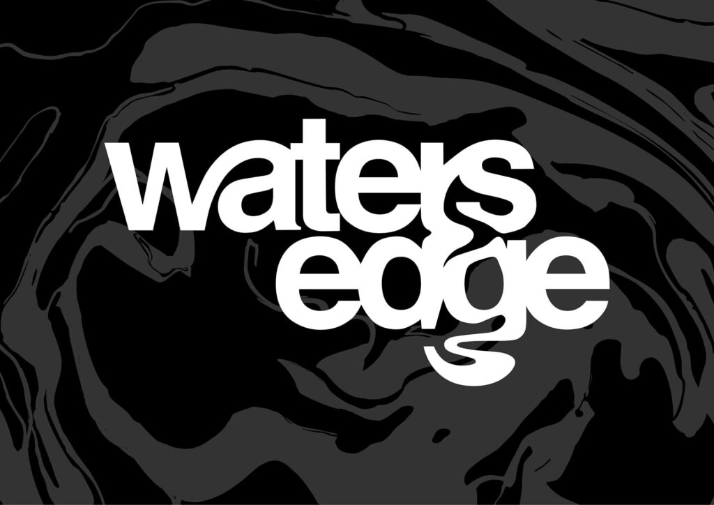
The logo is designed to mimic the flow of water. The use of distortion breathes life into the simple sans serif font that forms the foundation of the logo.
Here’s another example from our own website:
In this example, we’ve used a video to stretch the font out and spring it back into place. Giving the font an elastic feel as it snaps back into place. Again, this gives a fairly basic type-face much more character. And, subsequently, it’s far more interesting and memorable to audiences.
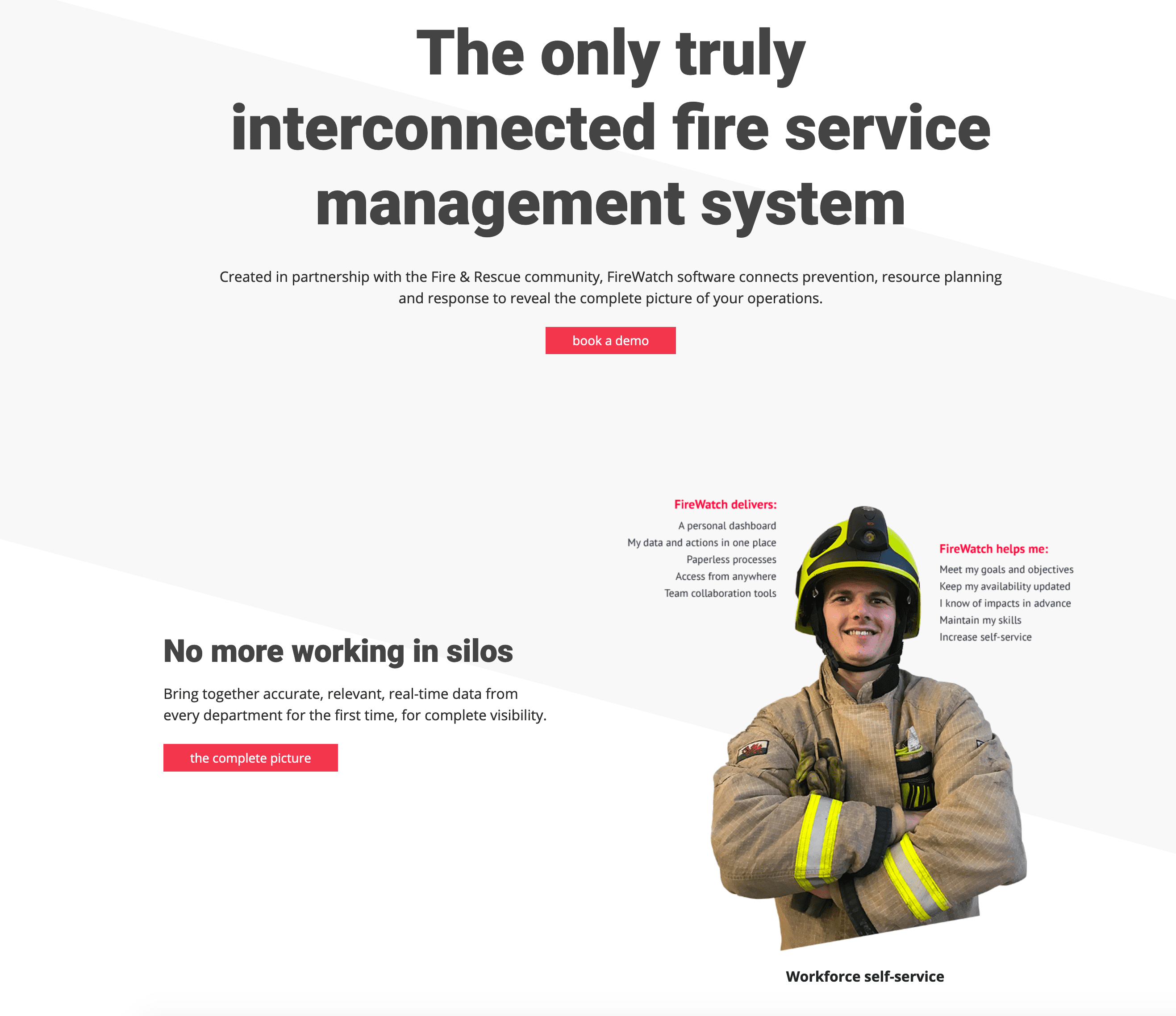
Asymmetric web design
While it’s been common to see asymmetric editorial design in print and publications over the years, most modern websites have traditionally stuck to symmetric designs.
Over the last 12 months, however, there’s been a growing shift towards edgier, asymmetric websites.
Take this example from the FireWatch website:
Or this example from Streamline’s website:
Since we’re used to interacting with static, symmetric websites, the asymmetric layouts of these websites have much more visual power.
They still look attractive, but they also look different and exciting. And, because of this, they’re likely to intrigue website visitors and hook their attention.
Gradients
Although Instagram have been rocking the tasteful gradient look since their 2016 rebrand, it’s only this year that it’s starting to creep its way into the mainstream.
And it’s showing up on all elements of graphic designers’ work – from logos and websites, to blog images and infographics, and more.
Be mindful that you go too overboard, you’ll risk looking out of touch and tacky. The trend is towards tasteful and refined gradients. As shown below.
From CDS:
And FireWatch:
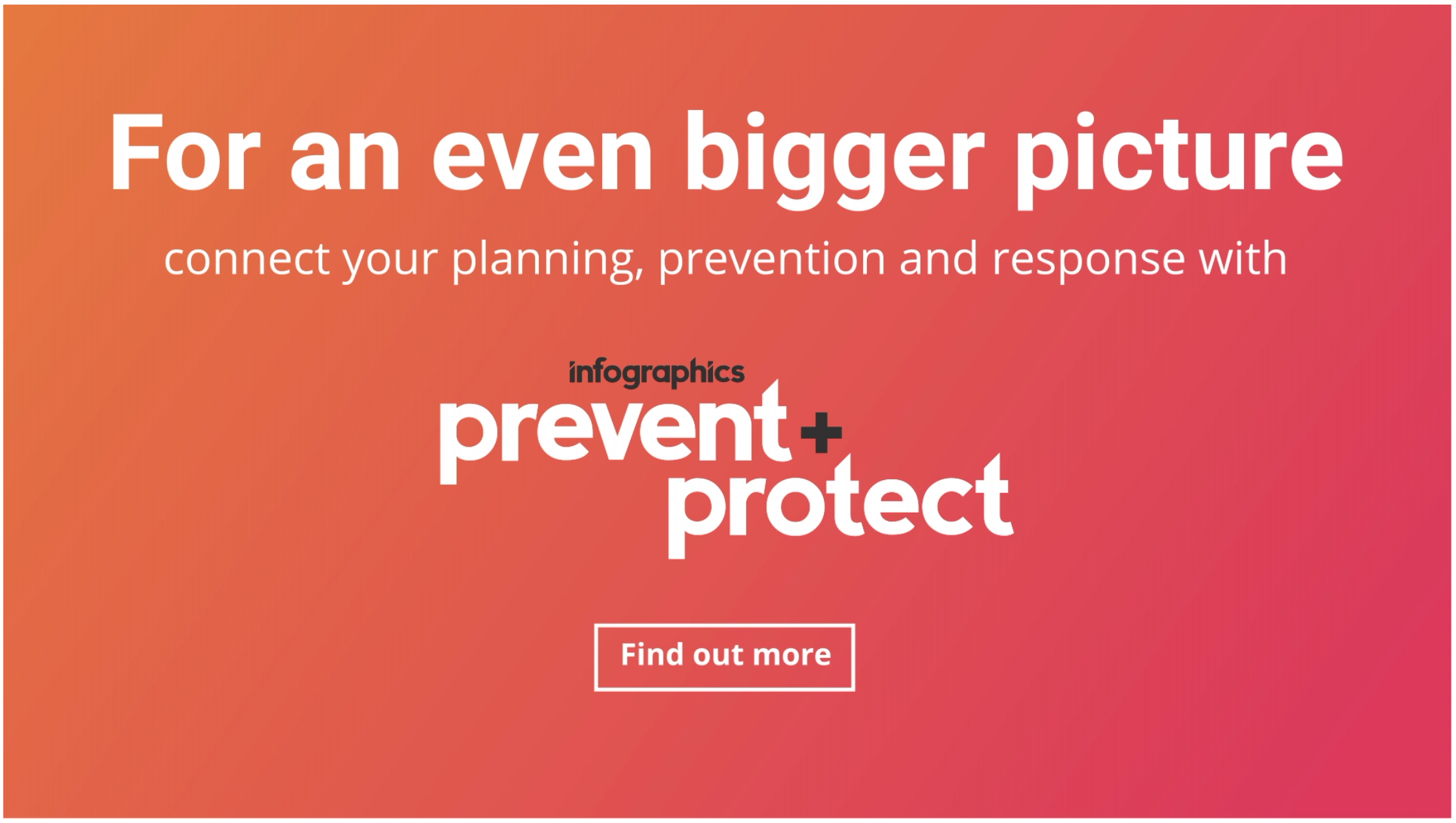
It’s easy to overdo a gradient. So, the trick is to use similar shades and complementary colours to get the sweet spot.
Wrap-up
If you’re looking to redefine your brand’s image or refresh your marketing content, trends are a great source of inspiration.
Especially as they often morph into the new consumer expectations.
But, it’s still important to experiment and push creative boundaries. After all, fitting in isn’t the best strategy if you want your brand to stand out.
If you can find a balance between creative experimentation and meeting the evolving needs of the consumer, you’ll ensure your brand stays both popular and relevant.
Want to talk about how you can work these trends into your own branding and marketing material? Then head over to the contact page and drop us a message or give us a call. We’ll be happy to help you push your brand’s image forward.