Brand guidelines – also called your brand style guide or brand book – are a set of rules that influence how your brand presents its image to consumers. These rules detail how your logo should be displayed, what typefaces and colours should be used in your brand assets, the tone you use in your messaging, and more. Their purpose is to keep your brand image consistent across every consumer touchpoint to ensure you’re easily recognised and remembered.
What’s in a Brand Guideline Document
Logo
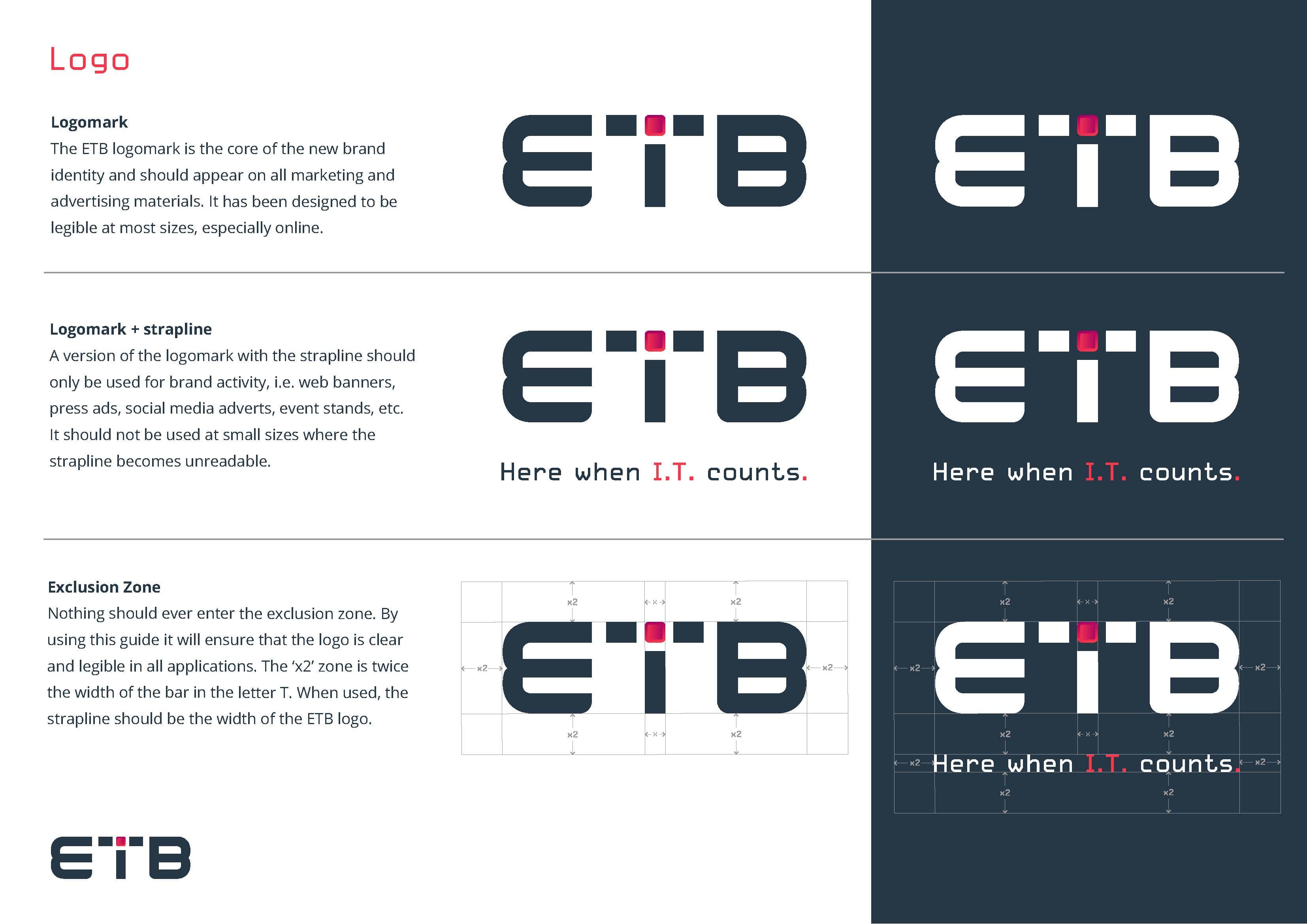
The logo is the most important part of your visual identity and branding. As such, a good brand guidelines document will usually start with a list of approved variations of your logo and how it should be displayed.
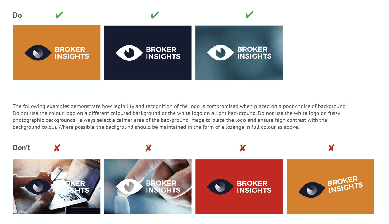
It will also specify how much clearance space there should be around your logo when using it in your content. By giving it this suggested “room to breathe” you’ll ensure it has enough visual presence to stand out against backgrounds. It will also detail the correct applications of your logo including examples that external partners can follow. This ensures you maintain brand standards and retain the quality of your logo.
Finally, if you have a company strapline, it should also offer guidelines on how this should be displayed next to your logo.
Typography
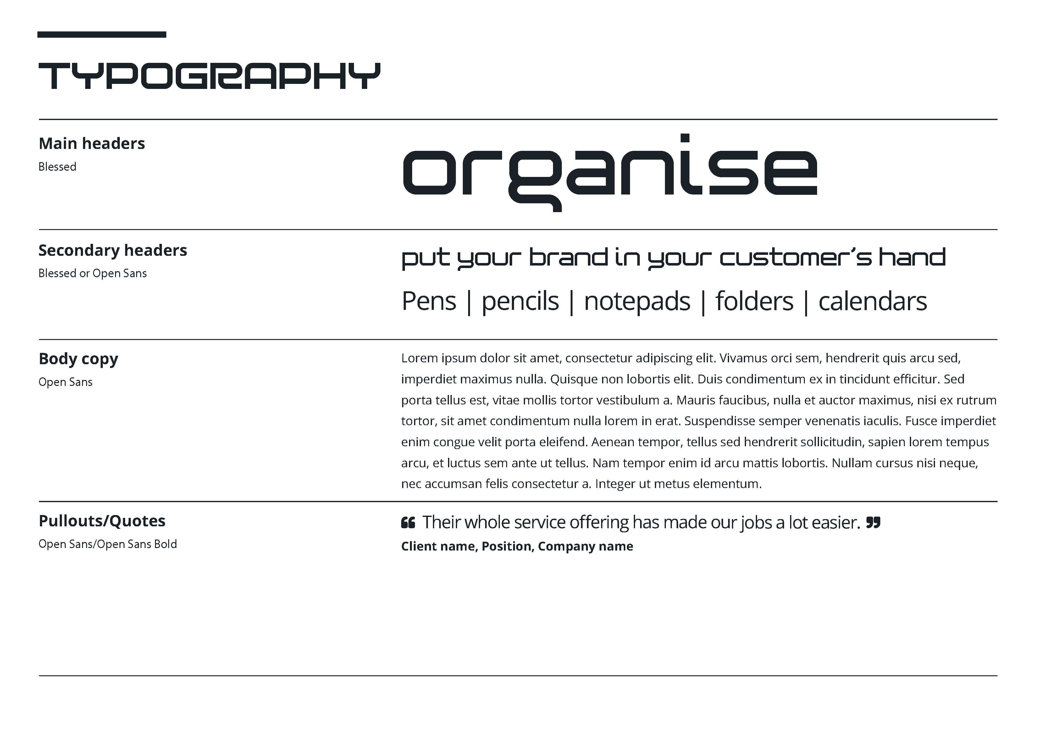
Next, the guidelines will detail the specific fonts your brand uses and how they should be styled. It will sometimes even include advice on the size, leading, kerning and line-height of your fonts. Don’t worry if these phrases don’t make any sense to you. So long as your designers understand them (and they definitely should), this won’t be an issue.
Brand Colours
Brand colours will also be detailed in your style guide including specific RGB, CMYK and HEX codes to ensure brand colours are consistent. But there’s also an additional benefit: there’s a psychology behind colour choice as various colours elicit different emotions.
By documenting the specific colours you want associated with your brand, a style guide can prevent a designer from using the wrong colour in an ad. Some documents will also split your brand colours into two separate categories: primary and secondary. Primary colours represent your core brand, the 2 or 3 colours that make up your logo. Secondary colours, on the other hand, are complementary colours that work well with your primary colours and can be used to add more variety to your branded content.
Icons
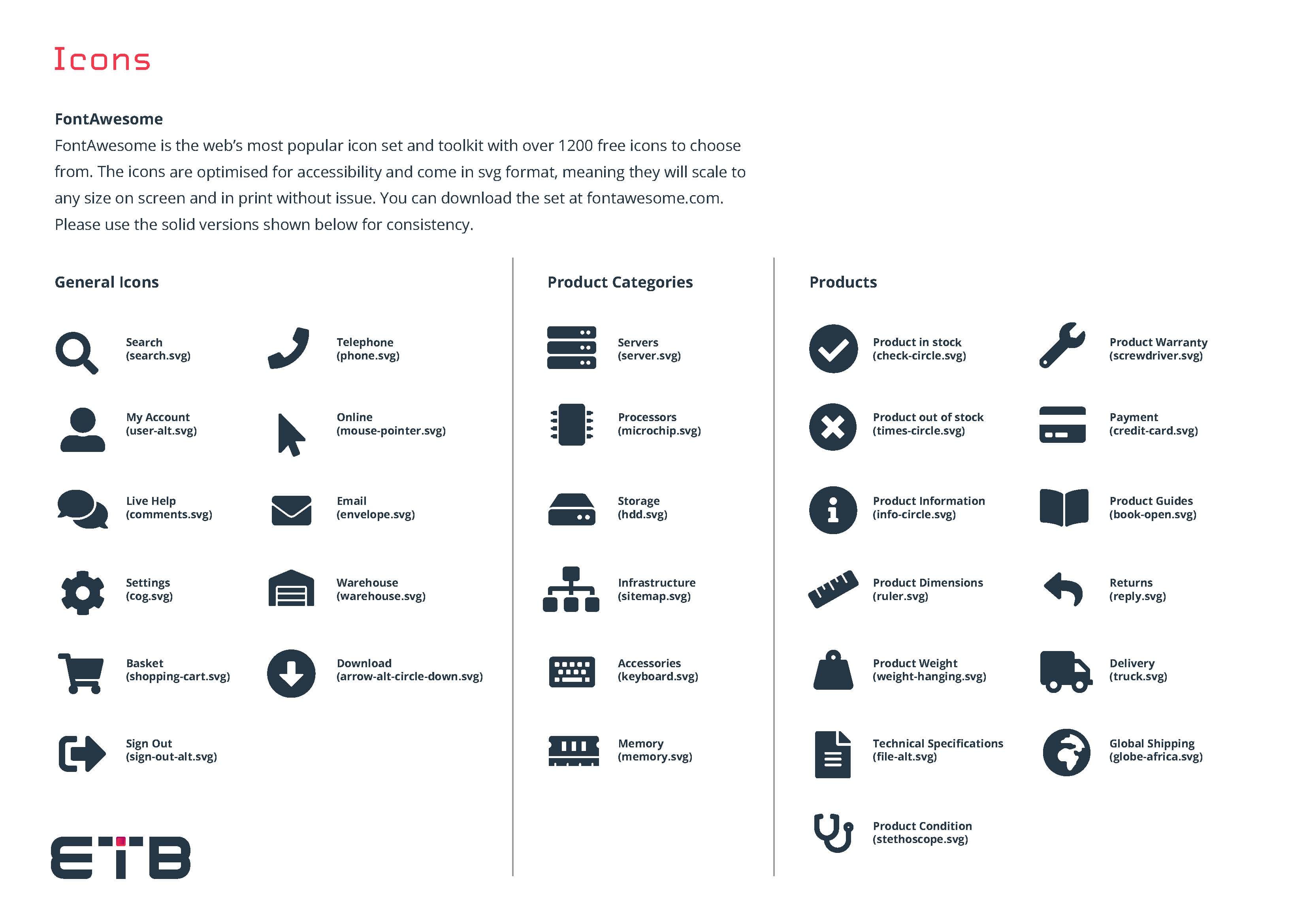
In the digital-age, icons are everywhere; on websites, in apps and even on footers in e-mails. But every brand uses a unique style of icon. For example, some brands use illustrative icons that have a hand-drawn quality, whereas others have a slicker, digital feel.
Style Tips
Although this isn’t always included, it can be useful for other designers if your guidelines show unorthodox examples of how the brand image should be represented. So, amongst other things, you’ll often find examples of how an HTML email, a business card or a poster for an event should look.
Tone of Voice
Your tone of voice – also called brand voice – is the way in which you speak to your customers and tell your brand story. And it will vary depending on your unique personality and target audience. Nike, for instance, have an inspirational tone of voice that communicates empowerment. But this tone of voice wouldn’t work for a brand like Burger King, as they’re targeting a completely different demographic.
Tone of voice guidelines don’t need to be complicated. The following statement, for example, sets a clear precedent that is easy to follow: “Our tone of voice is energetic, passionate and motivational. We use strong action verbs and avoid humour.” Of course, most style guides will include a little more detail, such as a list of preferred words, phrases and slogans, as well as examples of unacceptable writing styles. This offers further guidance and leaves less room for error.
Why do you need Brand Guidelines?
As mentioned earlier, brand guidelines are important because they give your designers and content creators rules to follow that ensure your brand’s image stays consistent across multiple consumer touchpoints.
More than that, however, they also ensure that everything stays consistent if you ever have a reshuffle. By creating brand guidelines, for example, you’ll have a document to hand if you hire a new graphic designer or marketing agency. This will tell them everything they need to know about creating content that’s consistent with your brand image.
There’s a reason the biggest brands in the world all have brand guideline documents; because a consistent brand image is one of the fundamental requirements for long-term success. If you want to replicate the success of a great brand, it makes sense to behave like one. And a brand guidelines document is a great place to start.
