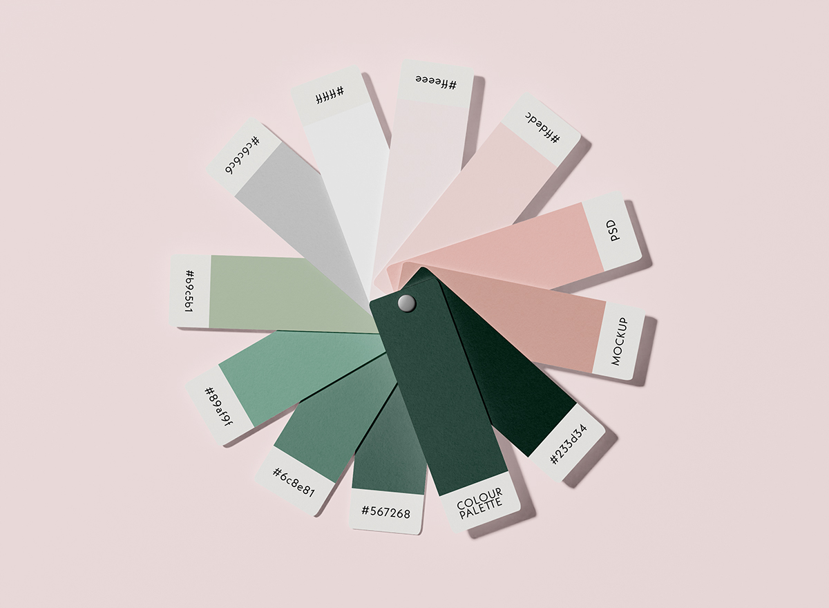
Colour sets the mood
The moment someone sees your logo or brand, their brain starts making decisions. Studies suggest that people form opinions within seconds and colour plays a huge role in that. For example, blue tends to evoke trust, calm and professionalism. That’s why banks and health brands favour it. Green signals growth and sustainability, so it shows up often in renewable energy and eco-conscious products. Red can trigger energy, urgency or passion – think of brands trying to create a bold presence or drive impulse purchases.
The rise of mood-driven colour
More recently we’re seeing a clear move towards colour palettes that evoke specific emotional responses. Brands are choosing colours that reflect values like calm, balance and responsibility. This isn’t by accident. After a few tumultuous years, economic pressures, political uncertainty, and climate anxiety, people are drawn to brands that offer a sense of stability.
Colour forecasting agencies have labelled shades like “Future Dusk” (a deep, moody blue) and “Transcendent Pink” (a dusty, nostalgic tone) as this year’s standouts. These colours aren’t just fashionable, they’re loaded with meaning. They signal comfort, resilience and a connection to something deeper.
For many businesses and organisations, especially those in finance, education or health, leaning into calming palettes can help build trust. Retailers and tech brands might explore bolder combinations, but it’s all about finding the balance between attention and authenticity.
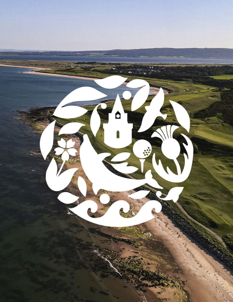
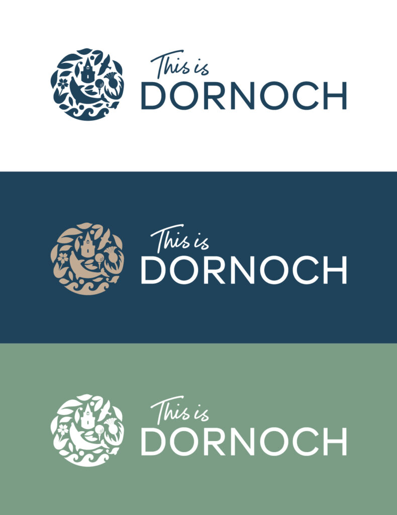
Real-world example: Rebranding the Seaside Scottish Town of Dornoch
We recently rebranded the beautiful town of Dornoch, who came to us with the goal of increasing its economic sustainability and transforming it into a year-round destination. Our approach to the design and the colour selection was to reflect its rich heritage and stunning coastal location. A sophisticated and muted palette of blue, green and sandy gold allowed us to create a feeling that truly reflects its environment and the welcoming nature of the town. Since the rebrand and launch of their new website, Dornoch has seen significant growth in visitor numbers.
Colour and sustainability
Sustainability credentials are often high when it comes to brand values. Colour is playing a quiet role in helping brands communicate their green values. Greens and earth tones are obvious choices, but it’s the execution that matters.
In the UK, brands like Riverford Organics and Octopus Energy use soft, approachable greens and purples, paired with simple typography and illustrations. They feel modern and human, not overly corporate. That’s no accident, it’s part of a bigger strategy to come across as friendly and forward-thinking.
For renewable brands, colour becomes even more important. You’re not just selling a product, you’re communicating ethics and future vision. Colour helps build that emotional bridge.
How to choose the right palette
If you’re rebranding or launching something new, here are a few tips to get your colours working harder for you:
- Think about the emotions you want to evoke. Is it trust? Excitement? Calm?
- Know your audience. Gen Z might respond differently to colour than older demographics. Younger people are generally more open to bolder palettes.
- Test before you commit. Try different palettes on brand identities or digital platforms. See what feels right.
- Use colour consistently. Once you’ve chosen a scheme, stick with it across social media, packaging, website and print. Inconsistency can damage trust.
Don’t overdo it
The temptation to use too many colours is real. But too much choice creates confusion. Most strong brands use one primary colour and one or two accents. Think of the simplicity of British Gas, Monzo or even Waitrose. You don’t always need a rainbow – you need clarity.
Final thought
Colour is one of the most powerful tools in your branding toolkit. It’s not just decoration – it’s communication. In a crowded market where trust and authenticity are more important than ever, your colour choices could be the quiet force driving connection, loyalty and sales.