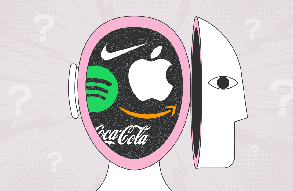
Your logo is often the first thing people notice about your brand. It appears on your website, your business cards, your products and in your customers’ minds. Yet despite its importance, logo design remains one of the most misunderstood aspects of branding.
More Than Meets the Eye
A logo doesn’t just need to look good – it’s visual shorthand for everything your business represents. But here’s the key insight: that meaning wasn’t inherent in the design from day one. Apple’s bitten apple didn’t automatically convey innovation. Nike’s swoosh wasn’t born representing athletic excellence. These logos became powerful through consistent use alongside positive brand experiences.
You’re not trying to cram your entire business story into a single mark. You’re creating a vessel that will hold meaning as your brand grows.
The Fundamentals of Effective Logo Design
Great logos share certain characteristics. Simplicity tops the list – not because it’s easy, but because simple logos are more memorable, versatile and timeless. A swoosh. A bitten apple. Three stripes. This simplicity is discipline, not laziness.
Memorability goes hand-in-hand with simplicity. Complex designs don’t stick in people’s minds after brief encounters.
Versatility is non-negotiable. Your logo needs to work at thumbnail size and billboard scale, in full colour and single colour, embroidered on clothing and animated in video.
Appropriateness matters too. Your logo should feel right for your industry and audience without being clichéd.
Finally, timelessness separates good logos from great ones. Avoid design gimmicks that will look dated in five years.
The Design Process
Professional logo design starts with strategy and research. Before sketching, designers need to understand your business, customers, competitors, and the personality you want to convey.
Designers then explore multiple concepts, resisting the urge to settle on the first decent idea. Strong directions emerge, get refined, and undergo iterative review and improvement.
Final stages involve perfecting proportions, adjusting curves, and ensuring flawless performance at every size and application. These details make the difference between good and genuinely excellent.
Common Mistakes to Avoid
Don’t try to be too literal – your logo doesn’t need to illustrate what you do. The most memorable logos create distinction through abstraction.
Avoid following trends too closely. Logos need to outlast fashions like gradient mesh or geometric animal heads.
Every element should serve a purpose. If you can remove something without losing meaning, it doesn’t need to be there.
Never start with aesthetics before strategy.
Deciding you want a “minimalist logo” before understanding what your brand needs is backwards.
Logo Types
Wordmarks use stylised typography (Google, Coca-Cola). Lettermarks create logos from initials (IBM, NASA). Pictorial marks use recognisable images (Apple’s apple). Abstract marks use geometric forms (Nike swoosh). Combination marks pair text with symbols, offering flexibility as brands mature.
Colour and Typography
Colour psychology influences perception – blues convey trust, reds create excitement, greens suggest nature. But choices should align with your strategy and differentiate you from competitors.
Typography conveys brand character before people process the words. Custom or significantly modified typefaces create uniqueness and reflect whether you’re bold, refined, friendly, or innovative.
Testing and Implementation
Test your logo rigorously at various sizes and colour variations. View it in actual applications. Get strategic feedback from your target audience and design professionals, not random opinions.
Create comprehensive brand guidelines covering minimum sizes, clear space, colour variations, and what not to do. Use your logo consistently across all touchpoints as consistency builds recognition and strengthens brand equity.
The Investment Perspective
Quality logo design requires investment in designer expertise, strategic thinking, and refinement. But this pays dividends for years. Think of it as foundational infrastructure – everything else you build rests on this foundation.
Be patient. Even brilliant logos need time and consistent exposure to become meaningful. Consider redesigning only when your business has fundamentally changed or when technical limitations hamper use. Evolution usually serves better than revolution.
Your logo is one of your most valuable brand assets. Invest in getting it right and let it work for you for years to come.


