A long time ago, in a theatre far, far away I first saw Star Wars as a wide-eyed 9-year-old. No other film has ever had the impact that Star Wars had, and the follow up, The Empire Strikes Back, only strengthened this. The universe created in the film widened and so did my imagination. Since then, the magic continues and somehow the essential DNA remains; through every bump and blip it is still there. This is due in no small part to my willingness for the magic to continue- I still want and believe that this can happen.
Apparently, others feel this way, too.
This faithful audience allowed Star Wars to infiltrate and influence many aspects of our culture including marketing and the design of ‘The Movie Poster’. Along with The Blockbuster Film concept that it also helped create, The Movie Poster has also evolved. Big budget films now need the first weekend to be MEGA, so they leave nothing to chance- no slow word-of-mouth marketing for these behemoths- no way. They must reach every possible member of their target audience and remind them over and over again that they must see this film. They will put as many characters into the poster as possible- not just the central 3 or 4 but as many as can comfortably (or uncomfortably) fit. This desire to reach all audience segments has led to the floating heads assembly that has taken over most blockbuster poster design.
Star Wars poster design has had some real gems but is it in danger of losing its spark, in much the same way as some would argue the films have? Let’s take a look and see what we think.
Star Wars: A New Hope
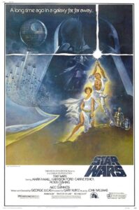
This poster is iconic now and interesting for a couple of reasons. The poster designer, Tom Jung, clearly had been given some slightly different instructions (or creative freedom) to give Luke an ill-fitting karate suit and Princess Leia a massive thigh slit and… where is Han Solo? There was no real trailer for this film and the marketing hadn’t really taken over just yet, so it is fascinating to see this version of marketing for the film- still love it, though. There’s a real wonder to it’s visualisation that jumps off the page at the viewer.
The Empire Strikes Back
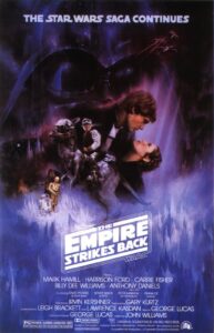
Much like the franchise, everything grew in scale and atmosphere with The Empire Strikes Back. All the artwork is handled brilliantly- this is probably the most beautiful poster- an excellent example of assembling all of the heads in a composition that is full of mystery and wonder. It practically forces the viewer to ask questions: ‘What is that creature Luke is sitting on? I want to see more.’ Han and Leia’s Gone With the Wind homage also works really well. It all manages to balance perfectly a new slickness with stunning paintwork. You can almost feel the chill coming off of it, and this atmospheric aspect makes it my favourite without a doubt. I can still remember opening The Toronto Star in the summer of 1980 and this double page colour ad leaping out of the newspaper- wow.
Return of the Jedi
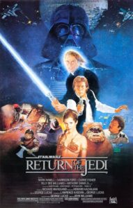
Ending a story often befuddles writers and creators, and the quality of execution in this poster again echoes the film’s difficulties in this regard. The poster is not as crafted and comes up a bit short in matching the atmosphere captured in The Empire Strikes Back. Not to mention that expectations by now were sky-high for the original trilogy’s completion- a bit of disappointment was inevitable.
Episode I: The Phantom Menace

A new era and a new start. This teaser poster promises so much, as did the trailer, which was released online for the first time. Unusually restrained, clever and minimal- this would be the last time for that, as from here on, the floating head mash up went full-tilt.
Episode II: Attack of the Clones
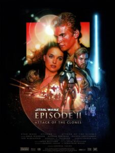
Attack of the lens flare again! Compared to Han and Leia’s Empire this romantic rendering appears much more wooden with less soul and less magic… a bit like the films, actually. Drew Sturzan’s reputation as the go-to guy for film posters strangely falls flat here. His work on Back to the Future is fantastic, but for me his style just doesn’t work here.
Episode III: Revenge of the Sith
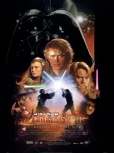
Firmly entrenched in the pyramidical floating head photo-gasm hierarchy now- more like Revenge of the Photoshop Montage.
Star Wars: The Force Awakens
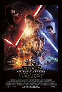
Some of the magic is indeed back, as there is a bit more energy infused in this layout, although the lightsaber angles almost-but-not-quite matching has always bothered me.
Rogue One: A Star Wars Story
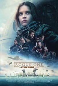
A bit dull and relies too much on a preconception that you’ll see it anyway. Where’s the interest?
Star Wars: The Last Jedi
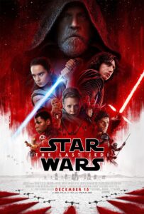
It’s a shame Mark Hamill didn’t get the the proper send off he deserved: a proper, full-on, save-the-day, no-holds-barred, kick-ass session between him, The First Order and Kylo; with a dramatic cliffhanger where he comes back to save the day. His dark, disgruntled features look mysterious at first, but in hindsight perhaps just a shade pissed off at how his character was written?
Solo: A Star Wars Story
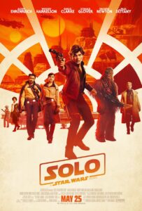
This stance evokes some classic B-movie sci-fi, which is appropriate; there are echoes of Buck Rogers and others here. However, I just can’t help wonder about the supporting characters in the background, as they look like bored runway models that have wandered into the wrong scene. A real shame because some elements really work.
Now: We Need a New Hope
There was an astonishing confidence in what George Lucas assembled in the first Star Wars film and it truly caught the world by surprise. That surprise was elevated to another level with The Empire Strikes Back and then let down a bit in Return of the Jedi. Magic is created from surprise and it’s hard, almost impossible, to recreate the original magic once that element is no longer available. It’s time to find that magic again, both in the storytelling and in the promotion of the final product. You don’t have to have a fully loaded smorgasbord of stuff to sell an idea- bring back some mystery, some soul, some magic. Hold back. You can do it.
Dear JJ – This is our most desperate hour. Help us. You’re our only hope…


