Is the city with the most iconic branding having a rebrand?
The new ‘We Heart NYC’ design has been met with outrage and mixed reactions from New Yorkers and the design industry. The new design which was thought to be replacing the classic ‘I Heart NY’ design created by Milton Glaser in 1977 is said to instead be part of an entirely new initiative for the city. The campaign is said to support the post-pandemic resurgence of the city and its neighbourhoods.
While controversial the new logo was unveiled with a more modern take. Gone is the typewriter-style font and in its place is an adapted Helvetica font. Graham Clifford the art director who oversaw the redesign has said the font is inspired by the lettering on Subway Signage across the city. The classic heart at the centre of the logo has now been replaced by a rounded three-dimensional image almost resembling an emoji and is part of a collection of emojis inspired by the city.
What do you think of the new design? Should they have stuck to the classic or is the new logo a fresh modern spin?
Click here to see the full new design
A Drinks Bottle you can also eat?
Don’t worry you haven’t stepped into Willy Wonka’s Chocolate factory this really is the next innovative design from the Swedish design studio Tomorrow Machine. In collaboration with juice company Eches, Tomorrow Machine has developed a bio-based bottled called GoneShells.
Made from potato the bottle can be home composted, dissolved under water or even eaten once finished. The core concept of Goneshells is that the lifespan of the packaging matches the lifespan of the contents inside. Inspired by the way fruit is revealed by its peel, you can unwind the bottle in a spiral-like fashion. Once the water-resistant barrier has been broken the bottle can be dissolved in water within 20mins.
What do you think of an edible drinks bottle concept? Click here to see the full article!
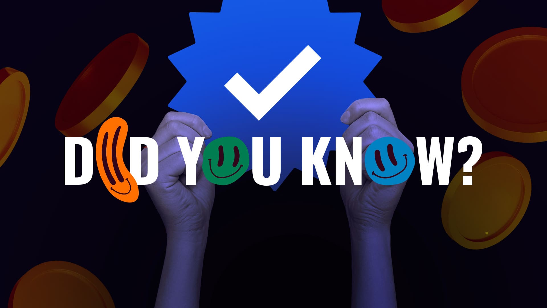
Would You Pay to view social media?
Meta is set to launch a new subscription bundle called Meta Verified on both Instagram and Facebook. Rolling out in Australia and New Zealand as a test before launching across the rest of the world users will be able to purchase a monthly subscription. Charging $11.99 on web or $14.99 for IOS and Android.
This new development has been met with mixed reviews with many calling it a “cash grab” or a rip-off of Twitter Blue. Mark Zuckerberg has said the aim is to improve the security and authenticity of the app.
Similar to the blue ticks verification tag Instagram already has a subscription that will give paying users the blue tick, increased post visibility as well as protection from impersonators.
This comes after the app launched an exclusive content subscription service where users can sign up for exclusive content from their favourite creators. Allowing creators a new way of being paid for their content.
Would you subscribe to view social media? Read the full breakdown here!
An enchanted typeface for Shakespeare’s Globe new season
Shakespeare’s Globe has revealed a new typeface for its new season. The new typeface design celebrates the 400th anniversary of Shakespeare’s first folio. Taking inspiration from its original woodcut illustrations.
Printed 7 years after his death the First Folio features some of Shakespeare’s most renowned works. The typeface was designed by the London-based design studio Typeland with the brief to use and interpret the folio illustrations. Bringing together the unique elements of woodcut illustrations while mixing in broader themes of nature.
Creating a versatile yet enchanting new typeface. Preview the new typeface here!