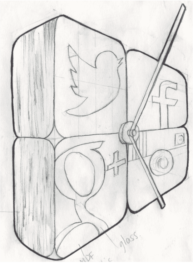
As I mentioned in the previous blog on my review of the ECA Degree Show 2013, I am a 5th year school student here at Elastic for a week of work experience to get a real insight into the design world. In my placement, the team have provided me with various design tasks and briefs and I have been asked to blog about this particular design I have come up with. My brief was to create a product for a business environment to remind them of their social media obligations, and through many mind maps, mood boards and sketches I have come up with this design. Above is a perspective drawing I made of my design to show the initial aesthetics of the product.
Design Analysis:
No matter how big a business is, social media has become a massive part of the branding, advertising, and overall growth of a business in the modern day world. Very often workers are usually extremely busy dealing with other problems and easily forget about their obligations to keep track of their social media to attract customers or to inform their clients of any changes, on websites such as Twitter, Facebook, Google Plus, Instagram and Pinterest etc. Having worked in an office environment I see social media is often forgotten about when it is a major part of the business so I have designed a product that could inform the workers when they should update their companies pages. As offices are usually pretty cramped with gadgets and products it would probably be more of a hassle to introduce yet another product so I have tried to incorporate my notification device in an object you would normally find in this environment. I have chosen the standard wall clock and feel this will increase space as the one object provides two services. This object was also chosen, as with many workers, if they have run out of tasks, will tend to look at the clock and check the time, if the clock reminded them of another task they could perform then it will keep the workforce busy. The wall clock consists of four interchangeable curved cornered cubes presenting various social media logos that will flash when a certain amount of time has passed with no site activity, alerting the workers in the business that an update must be made. The four cubes are hollow and light bulbs must be fitted inside each one and when there has been a lack of activity on the specific site the bulb will flash that will make the cubes glow in intervals from the outside, alerting the workers. In my placement here I was introduced to Adobe Illustrator which I had never used before, and through much trial and error, I managed to create this 3D representation of my design.

In terms of aesthetics, I have tried to design this product in a pleasing way that would make it stand out and be noticed in the work place. Bright vibrant colours have been used in the four different cubes at the front making it noticeable and aesthetically pleasing. This contrasts with the brown coloured wood colour seen by the side profile. Treating the wood, varnishing and buffering it will enhance the shine and make it feel like a better-designed, more expensive product adding to the aesthetic qualities of the clock. The product is made of a combination of curved and straight lines and square, rectangle and circle shapes, giving the appearance that a designer has been used in its design and aesthetic. The product’s cubes have to be hollow so the light bulbs can slot in but if I was to take this product into the manufacturing process, I feel I would use a hardwood veneer for the sides and a thermosetting plastic for the front.
Overall I have really enjoyed my time here at Elastic and I feel it was a definite eye-opener into the graphic design and branding world. I have no idea what my future will hold but am looking forward to the prospects of university and beyond and on studying something in the design field.
Elastic provides digital design services. Please contact us if you want to find out more.


